Bank of us
It’s not everyday you get to create a brand identity for a bank. Especially a progressive one. Bank of us is not like your typical bank. Formerly a building society, Bank of us is a customer-owned bank, meaning the profits are reinvested to benefit customers and their communities – not profit for external stakeholders. Unlike the big banks, their customers actually have a say about where the profits go. It’s as if a small part of their DNA is invested in the bank. Creating a brand identity for a client with a fresh take on the banking sector has been a career highlight. The brief was to create something ‘unexpected’.
‘Placing our people at the heart of banking’ is the core meaning of the Bank of us logo. The different circular layers of the ‘rings’ graphic represent Bank of us on the outside, followed by Tasmania, the community, with the customer at the centre. The variation in shape, placement and colour of the rings refers to the diversity that comprises all of these different segments. Radial designs generally reflect inclusion, openness and collaboration combined with freehand, organic components reflecting the down-to-earth, friendly, contemporary approach of Bank of us. Paired with the logo is the ‘cluster’ graphic device. Used as a further visual extension of the logo meaning it allows for playful and energetic brand expression across all collateral and communications.
Studio ©2017 The20

Bank of us brand identity
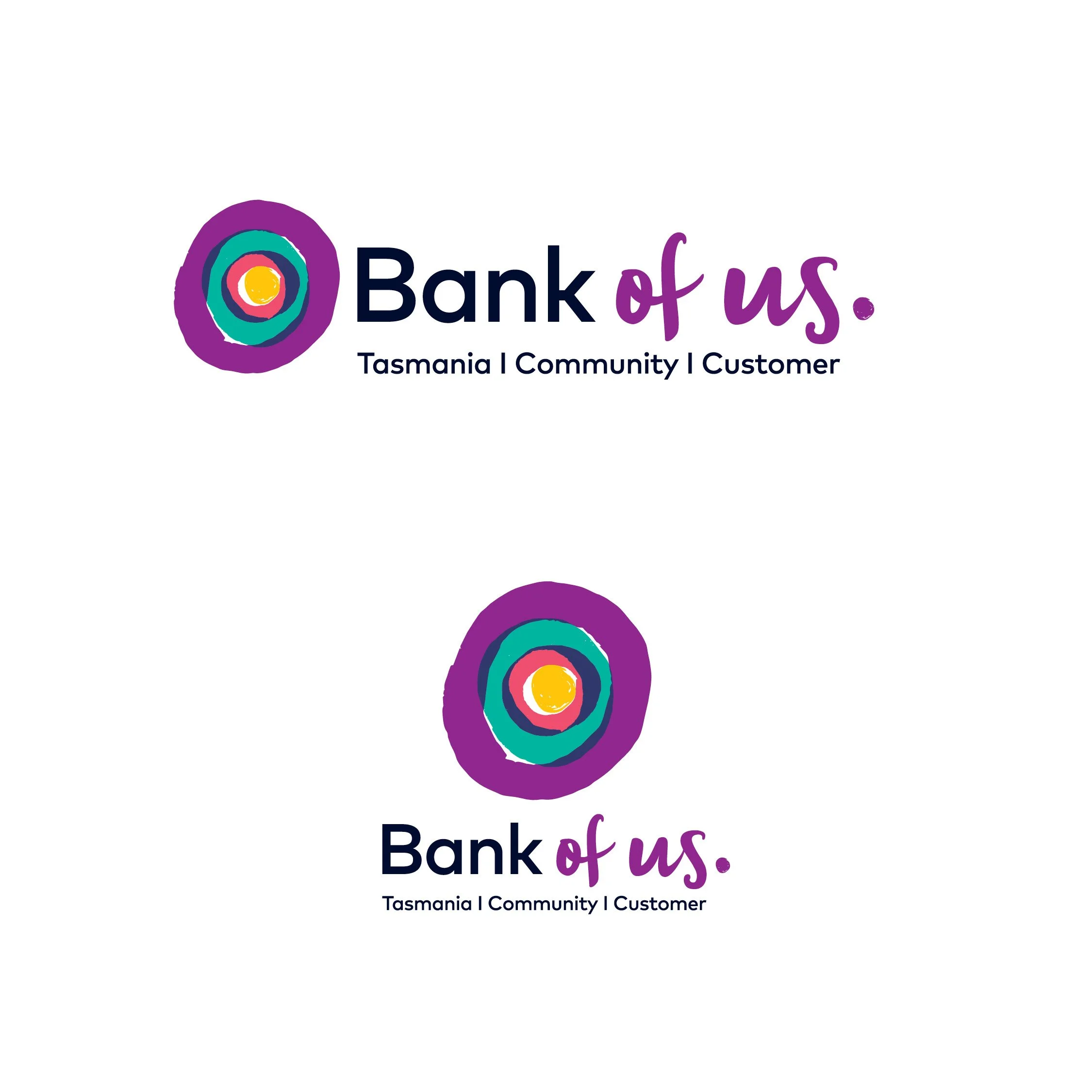
Bank of us logo variations

Visa Debit card
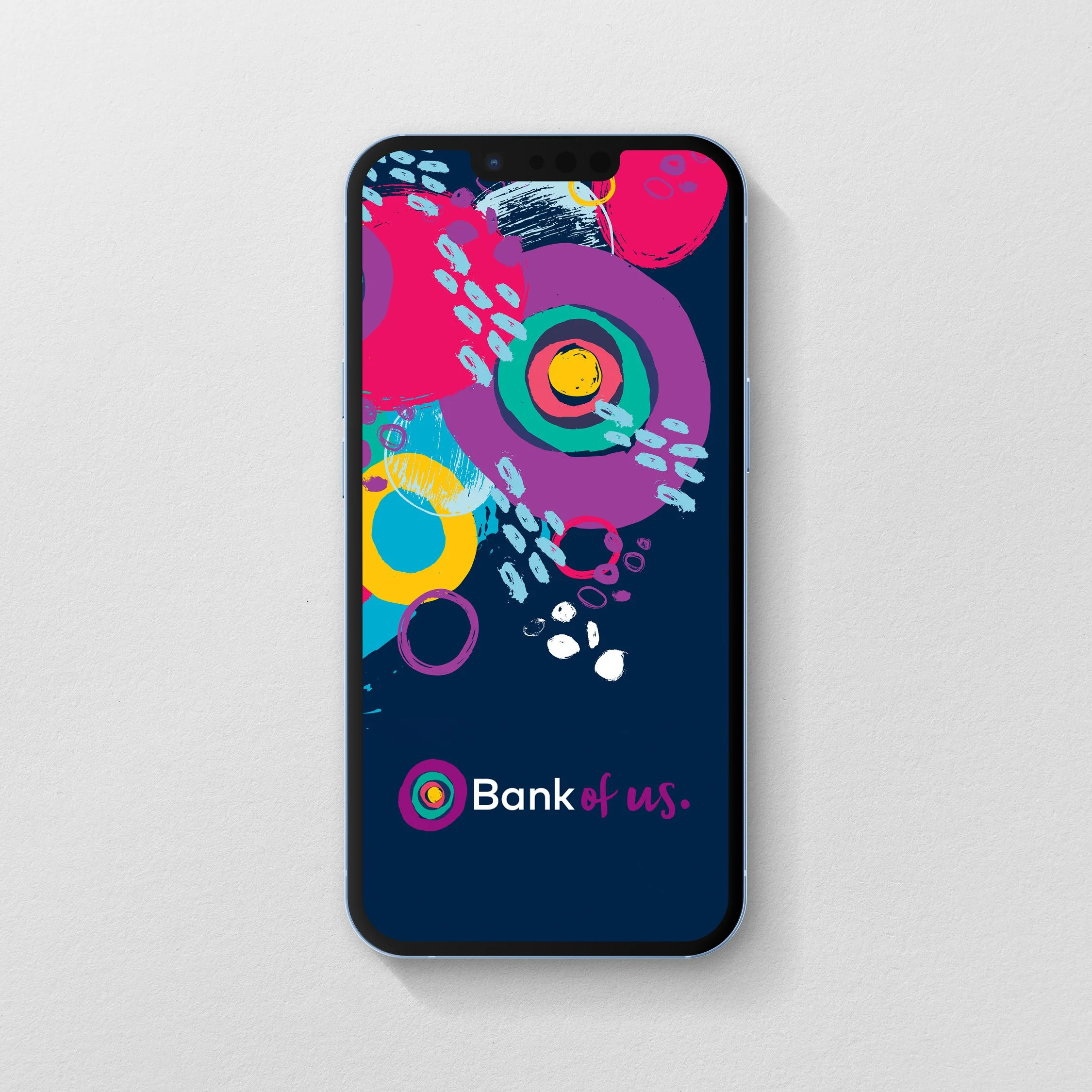
Banking app graphics
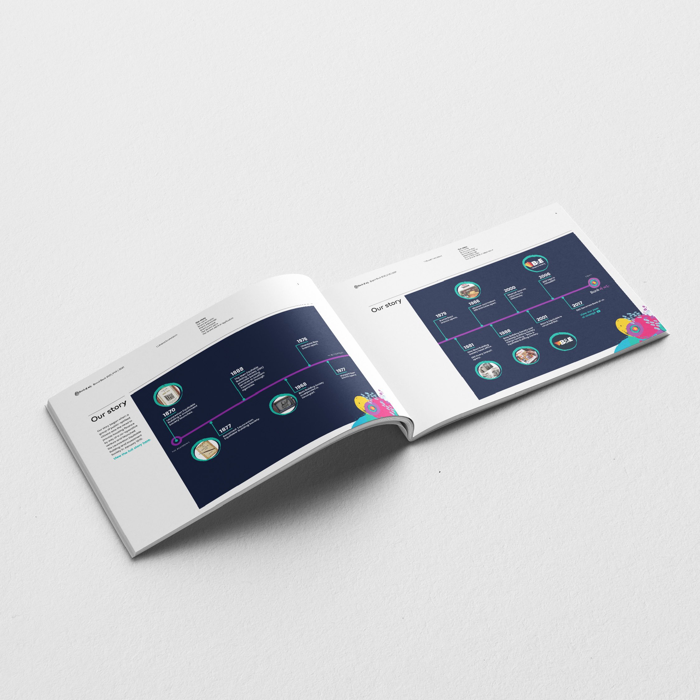
Brand Book | Our Story
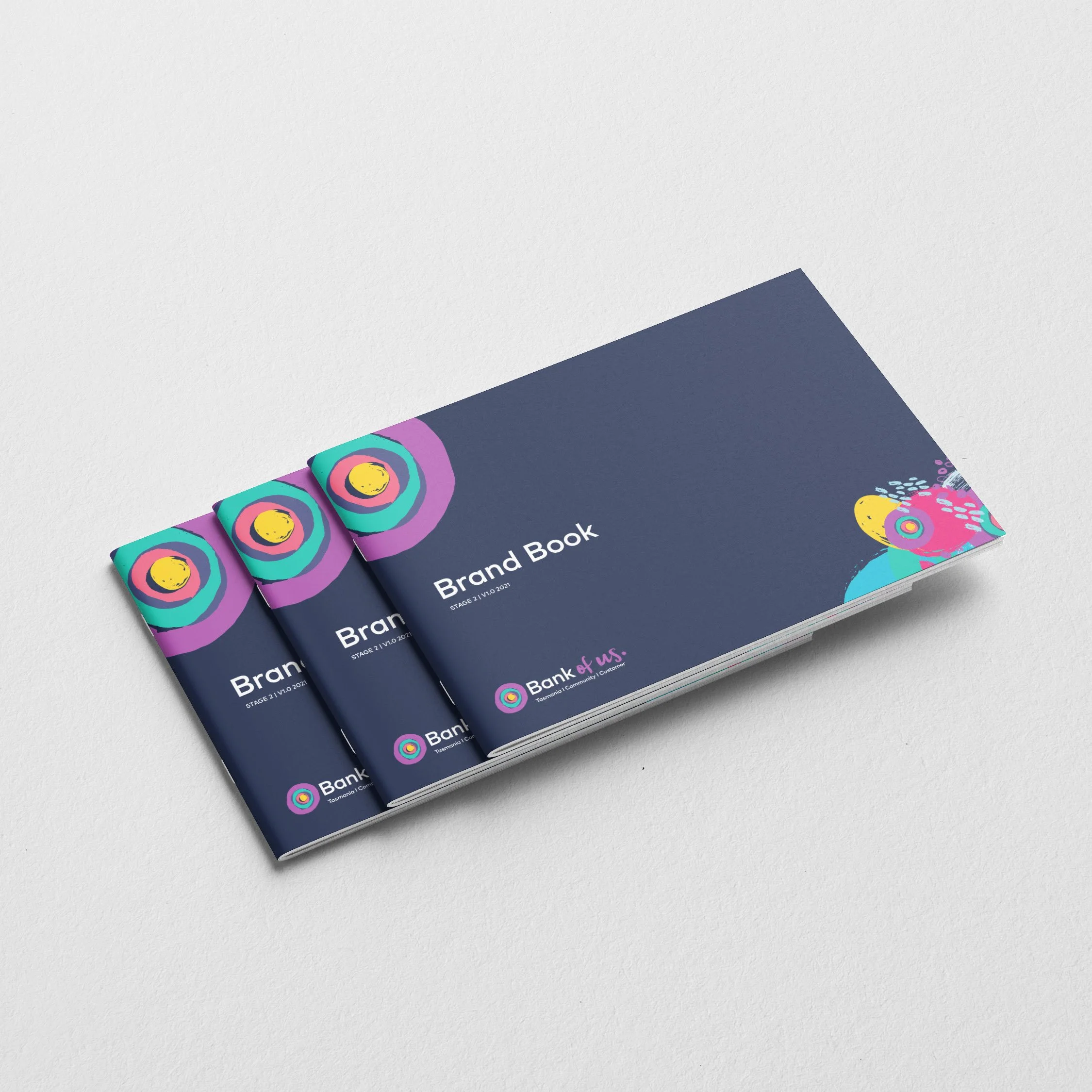
Brand Book
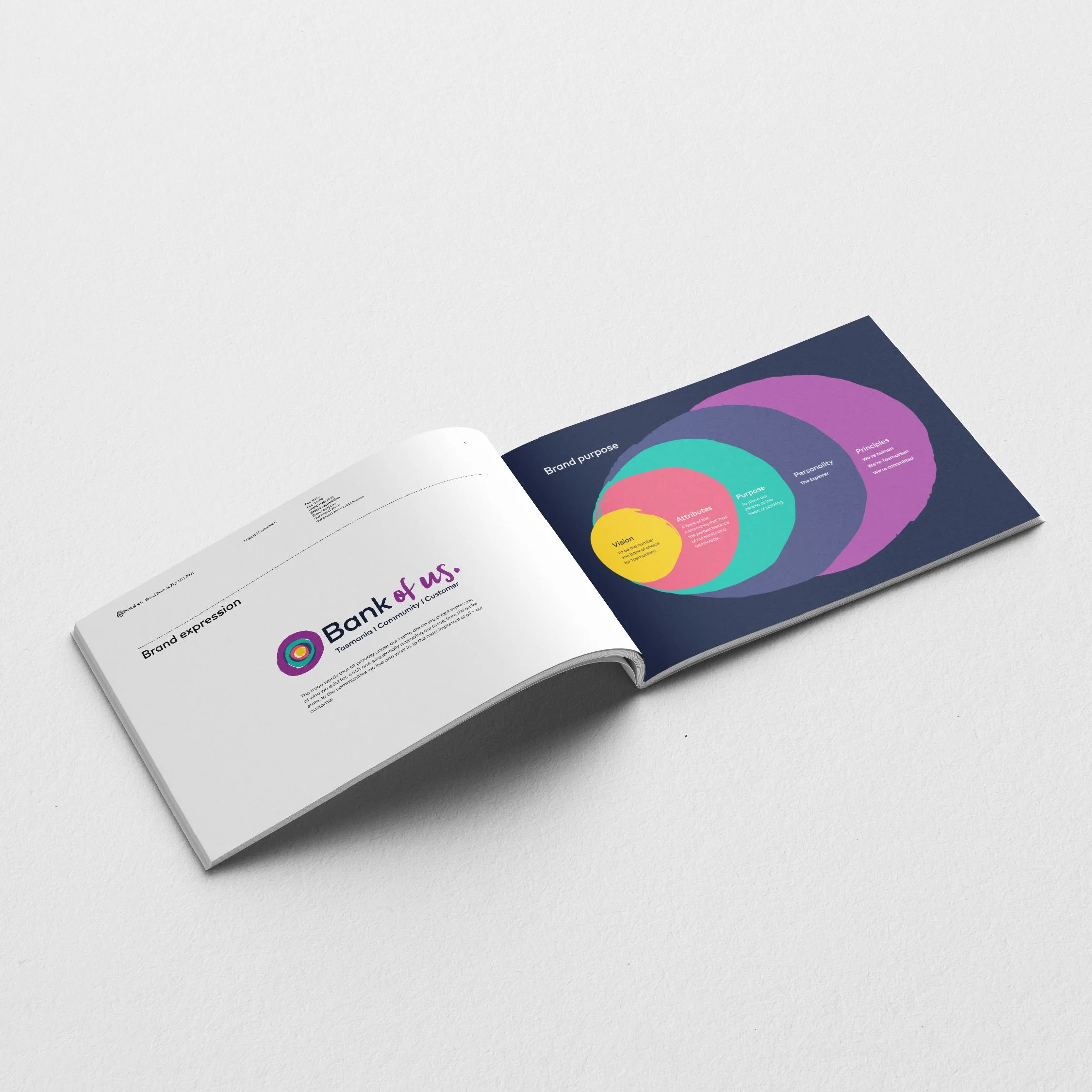
Brand Book | Brand Purpose
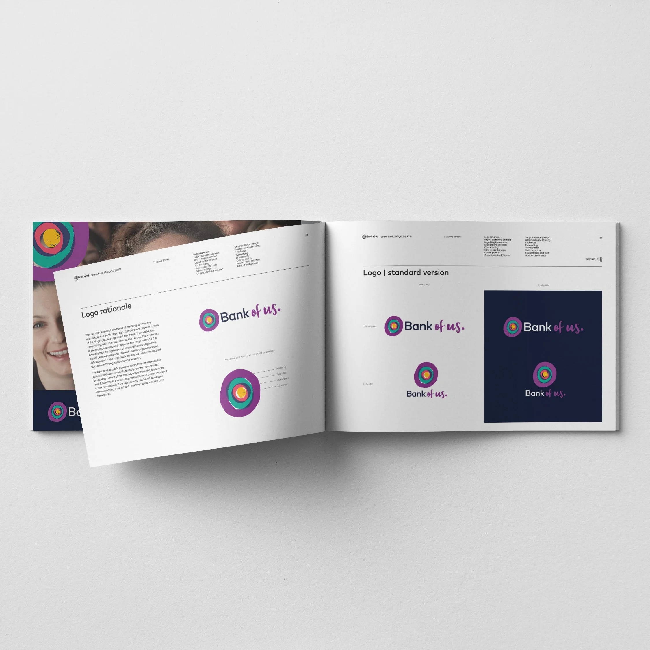
Brand Book | Logo rationale
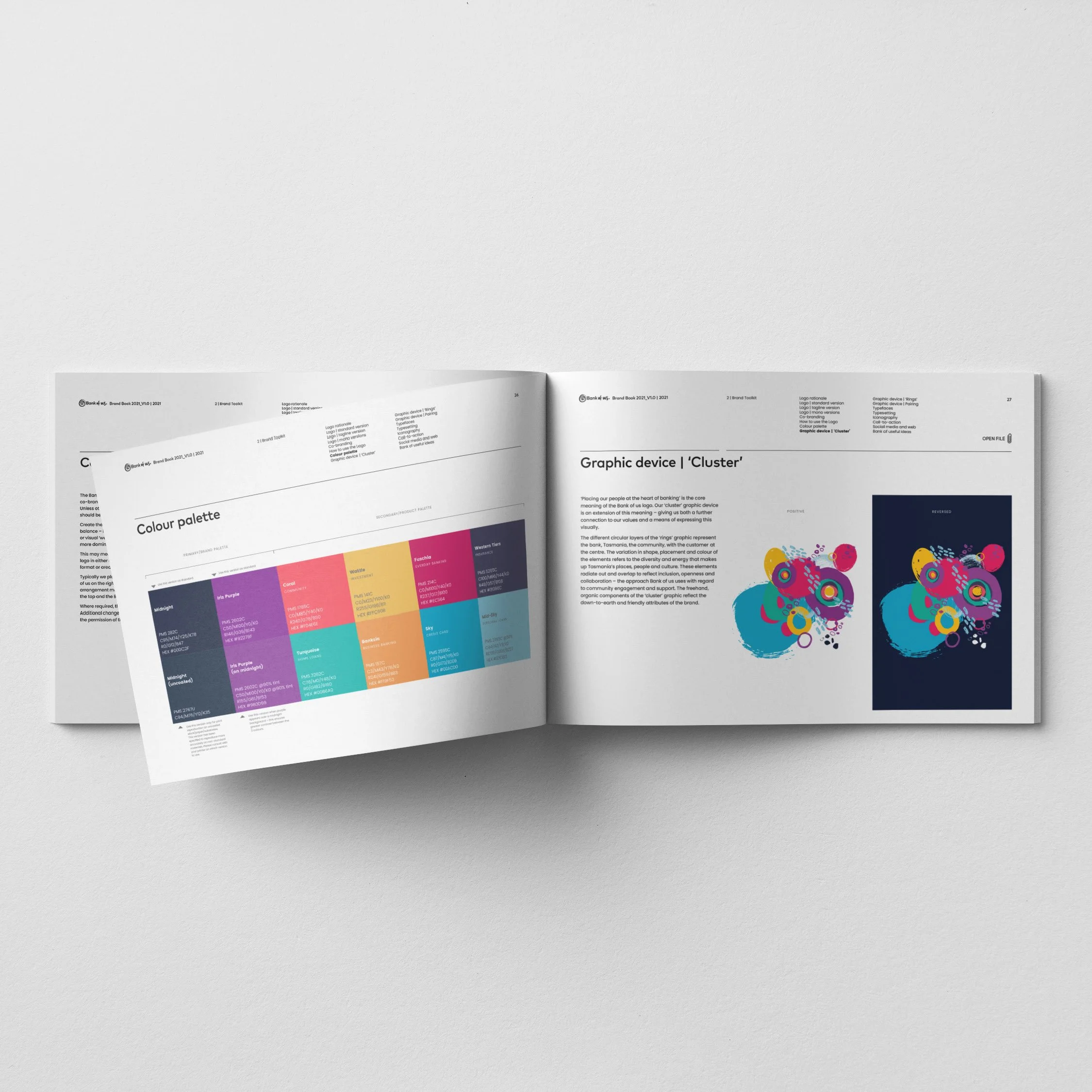
Brand Book | Design elements
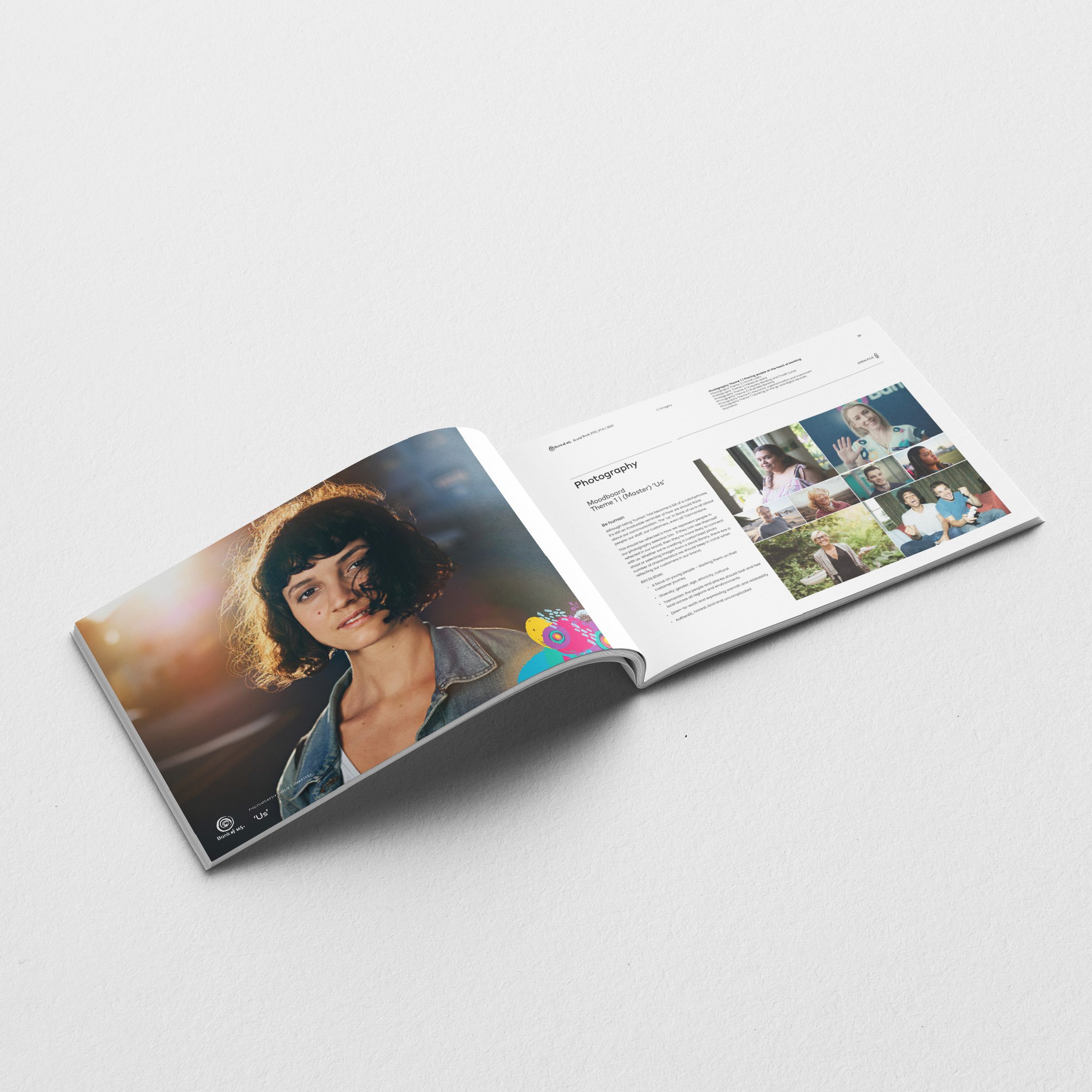
Brand Book | Photography Moodboard ‘Master Brand’
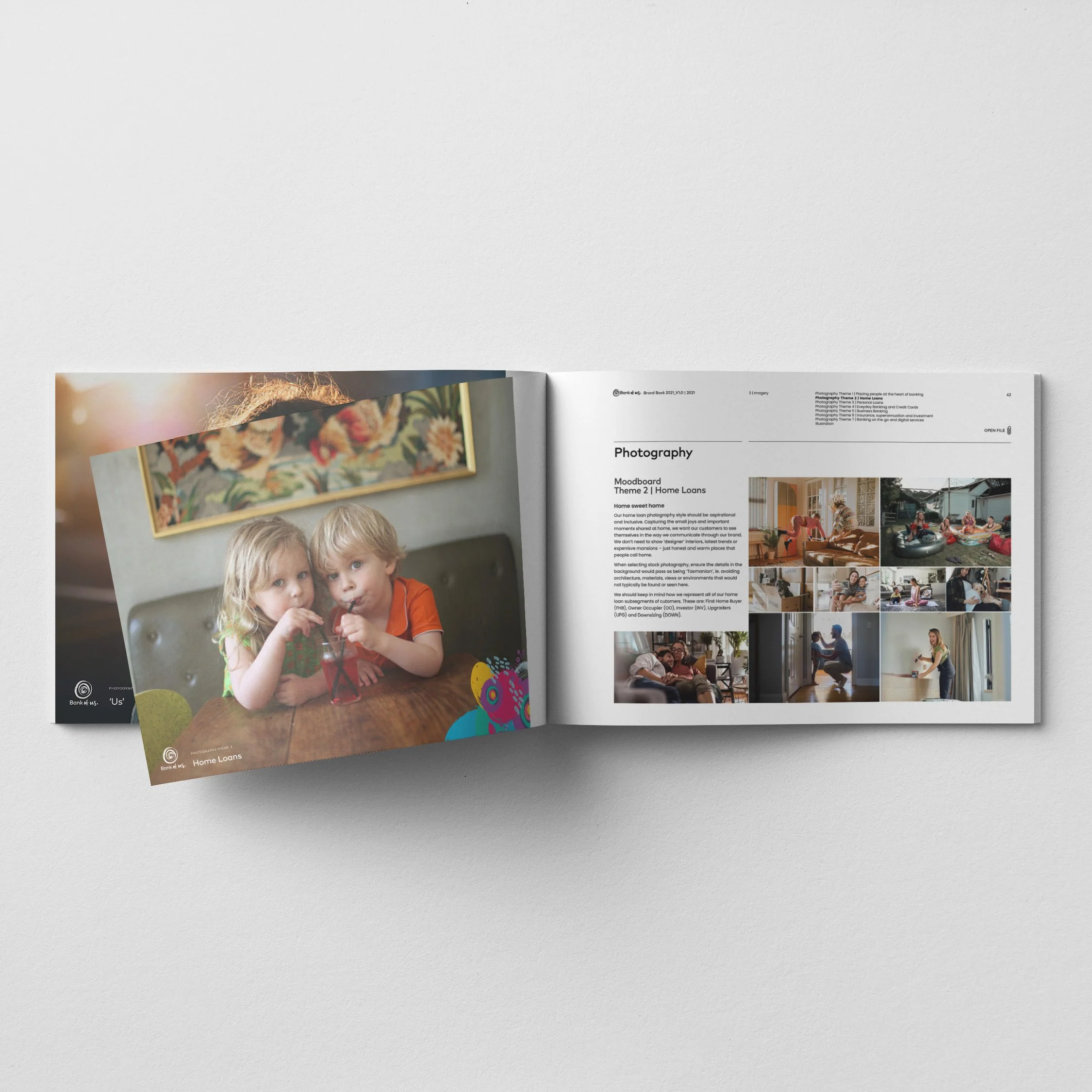
Brand Book | Photography Moodboards ‘Home Loans’
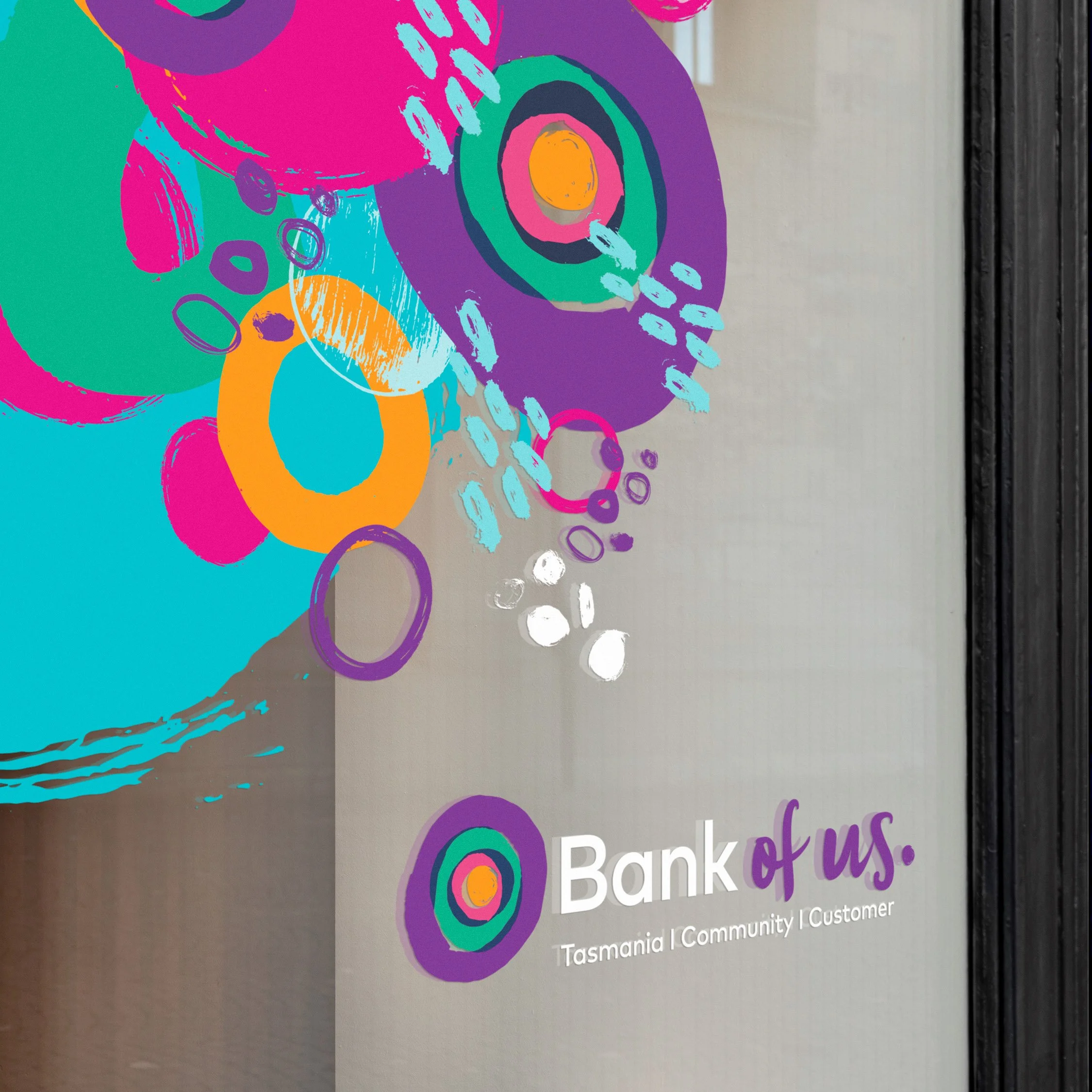
Branch window decal
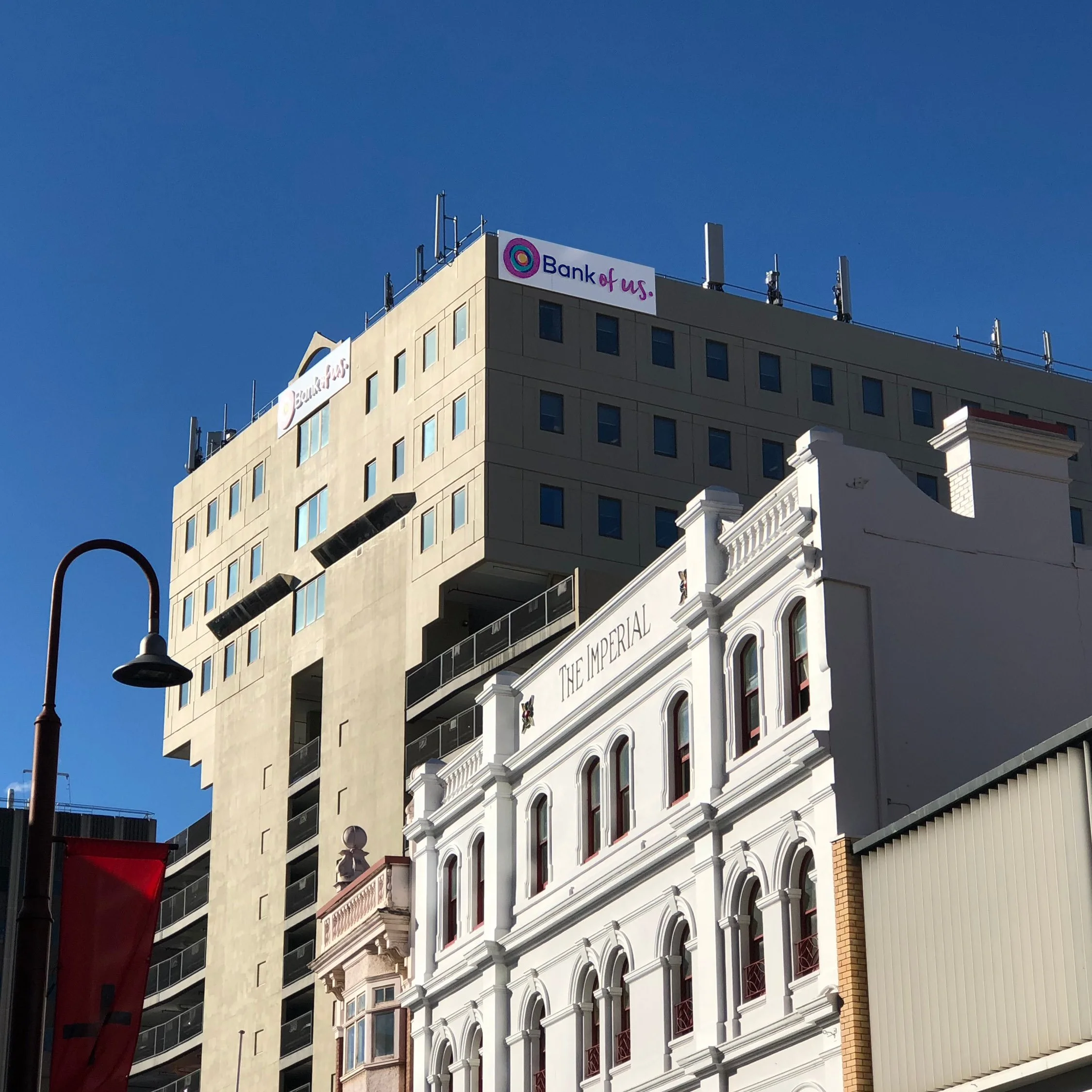
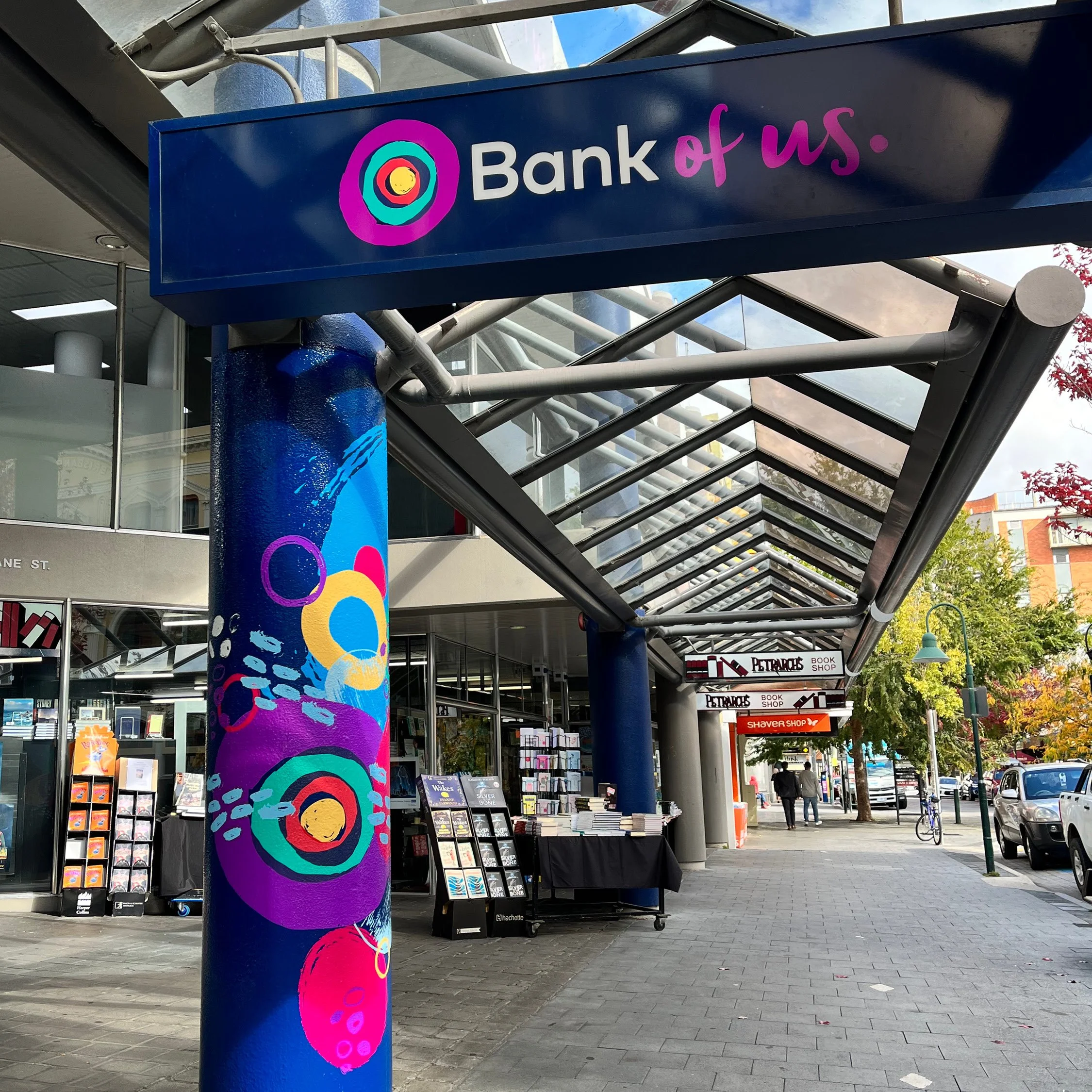
Branch exterior signage | Hobart, Tasmania

Launch campaign poster
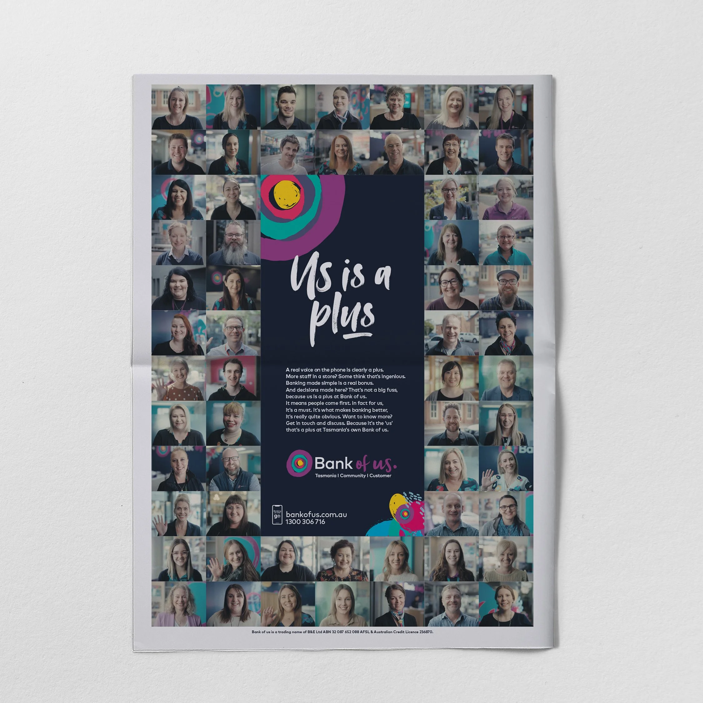
‘Us is a plus’ campaign press
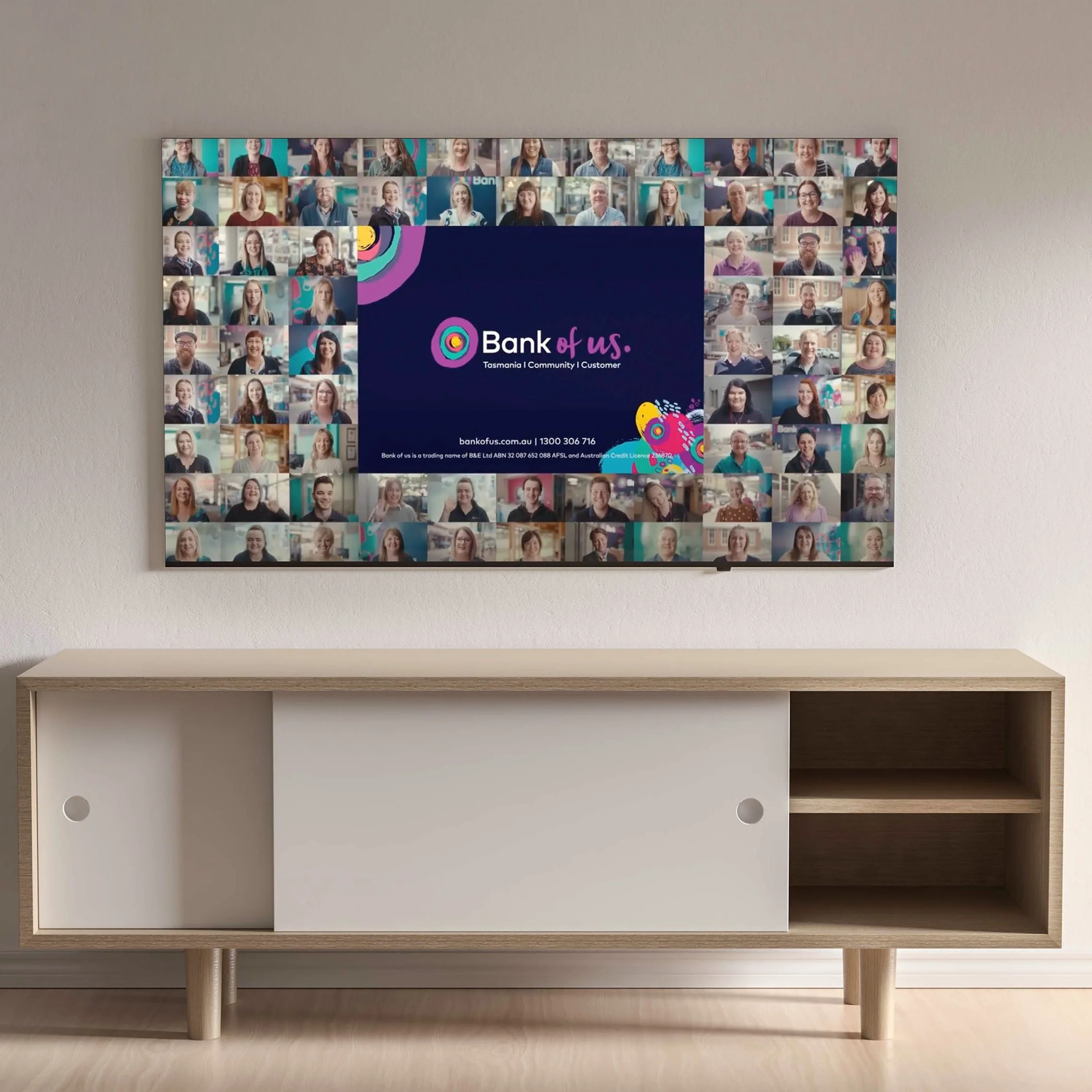
‘Us is a plus’ campaign TV graphics
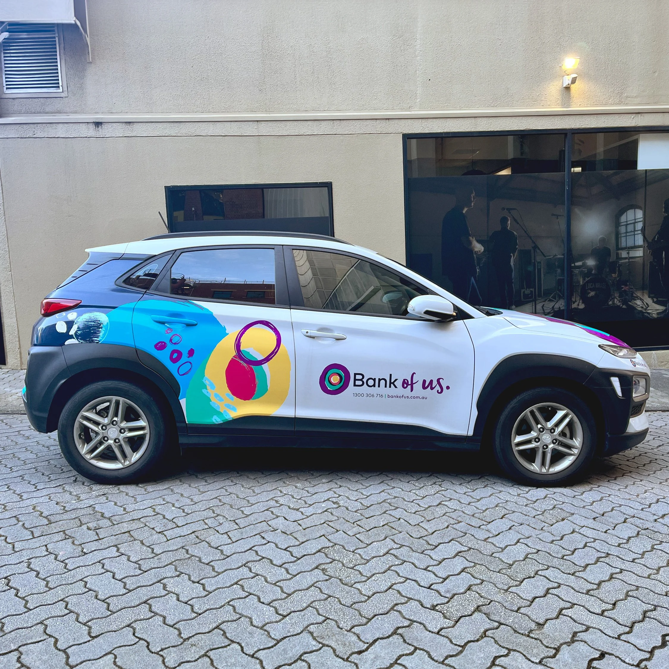
Vehicle graphics
Branch exterior signage | Launceston, Tasmania
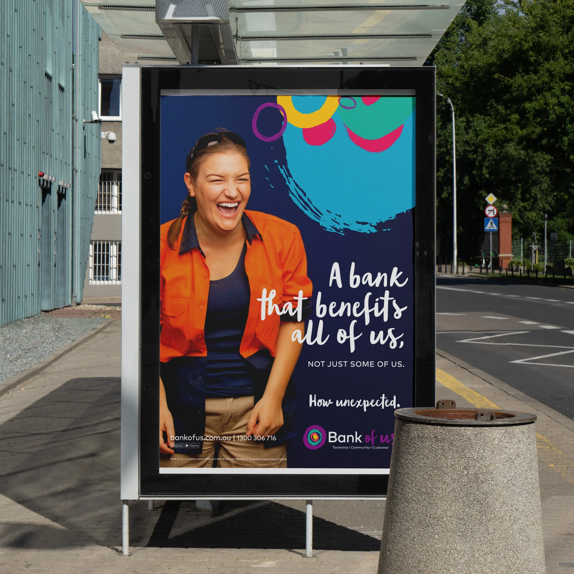
Launch campaign poster

‘Us is a plus’ campaign graphics
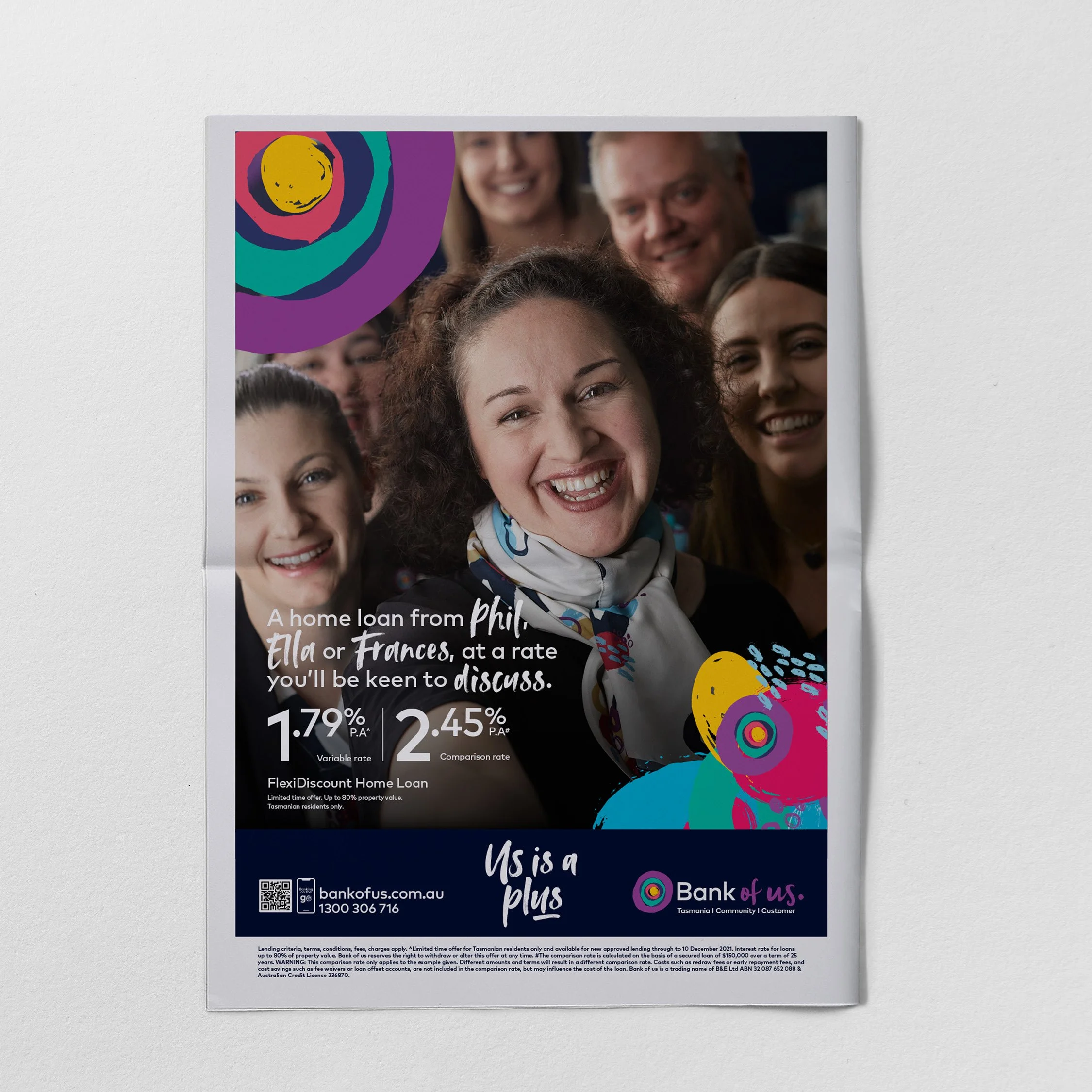
‘Us is a plus’ campaign press