Columbia Aged Care
Columbia Aged Care has a progressive and contemporary approach to aged care. Situated in New South Wales, their homes are welcoming, bright and cheerful and their attentive staff ensure the highest quality of care for the residents. Columbia’s CEO wanted this approach to be reflected in their brand refresh and at every communication touchpoint – both to enable residents and as assurance for their families.
How the aging eye interacts with shape and colour, as well as challenges to text legibility for residents was a crucial part of the brief. Encouraging activity and participation to improve wellbeing for the residents was a guiding principal in the creation of this suite of collateral. A custom designed pattern was created incorporating each of Columbia’s home locations’ local flora. This combined with clear typography, was used to define wayfinding, carer name tags, personalised room signs for residents and in digital spaces. Columbia is also home to residents of diverse cultural backgrounds where collateral items accommodate multiple language translations. Participating in a meaningful and considered project such as this, are amongst those I find most rewarding and purposeful as a designer.
Studio ©2022 Before Creative

Custom designed pattern as part of new brand identity refresh

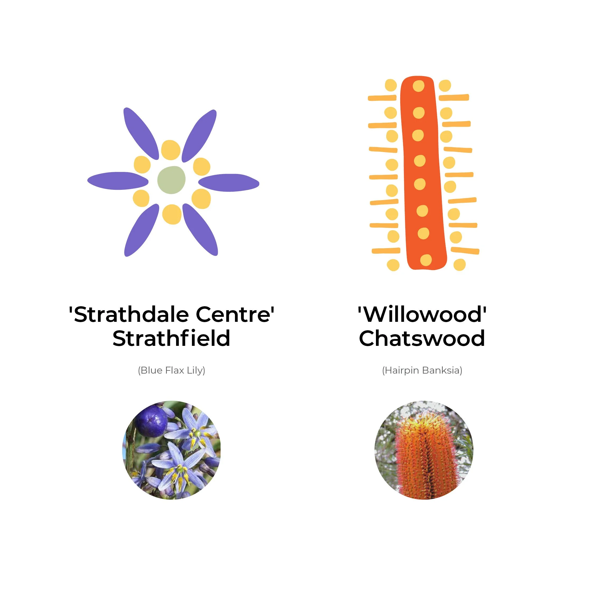
Each location of Columbia’s homes was designated a local floral emblem which is included in the brand pattern.
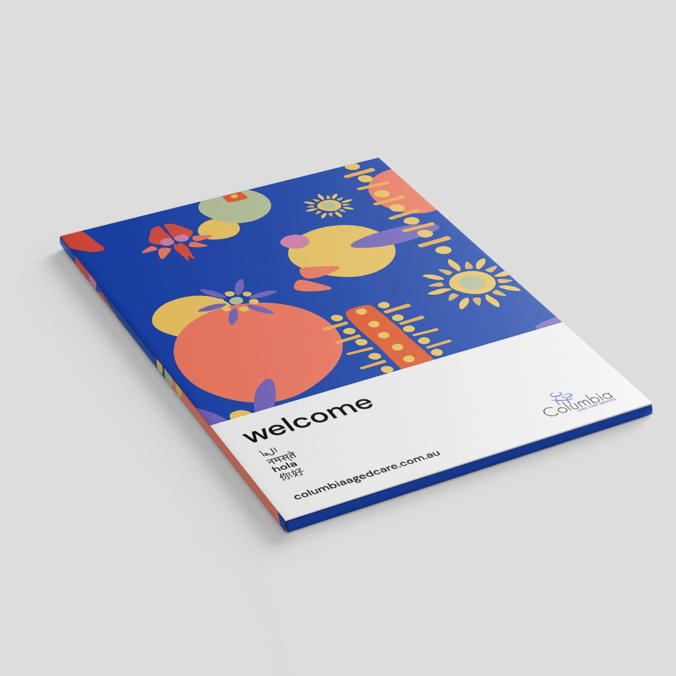
Columbia is home to residents of diverse cultural backgrounds. Collateral items accommodated multiple language translations.
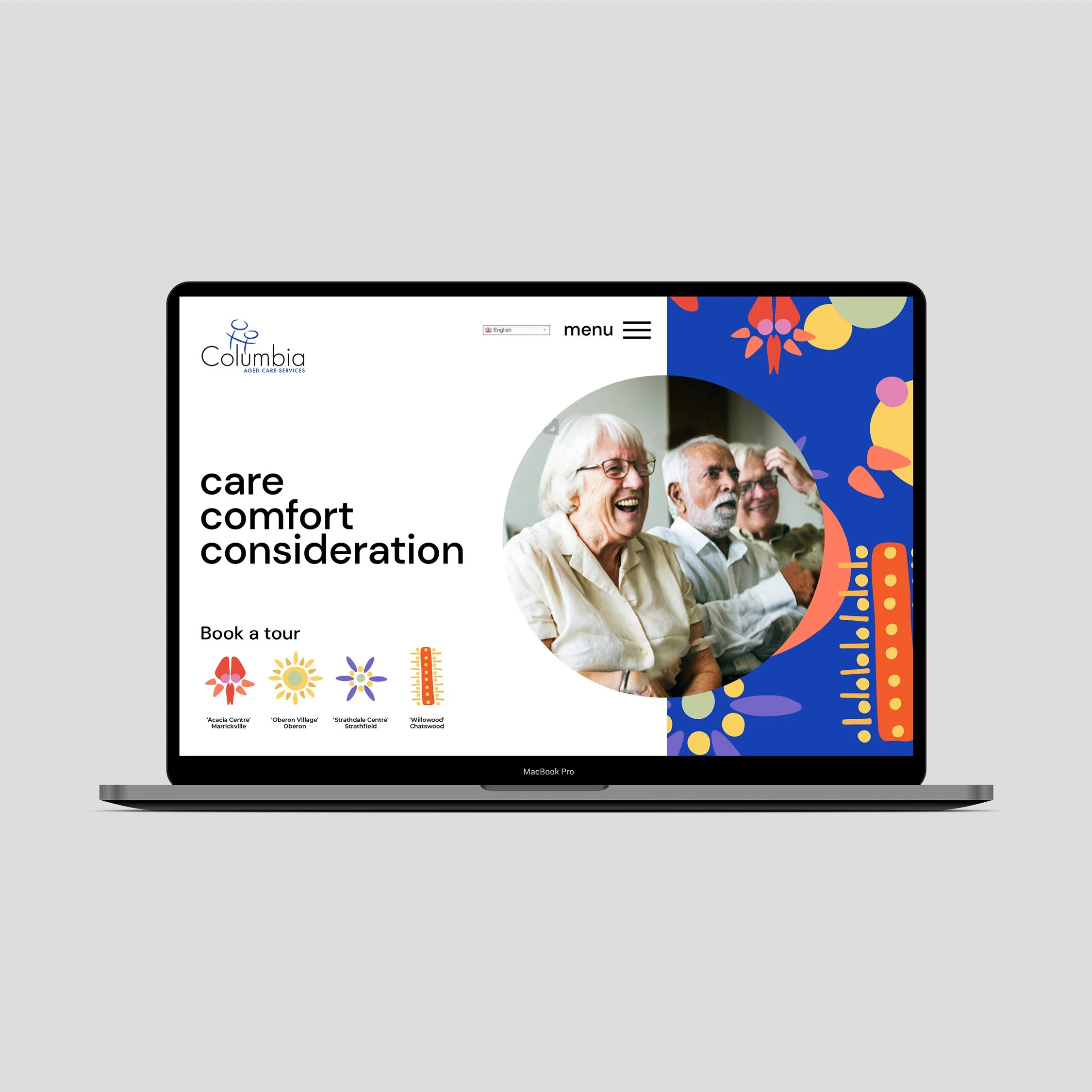
Website design
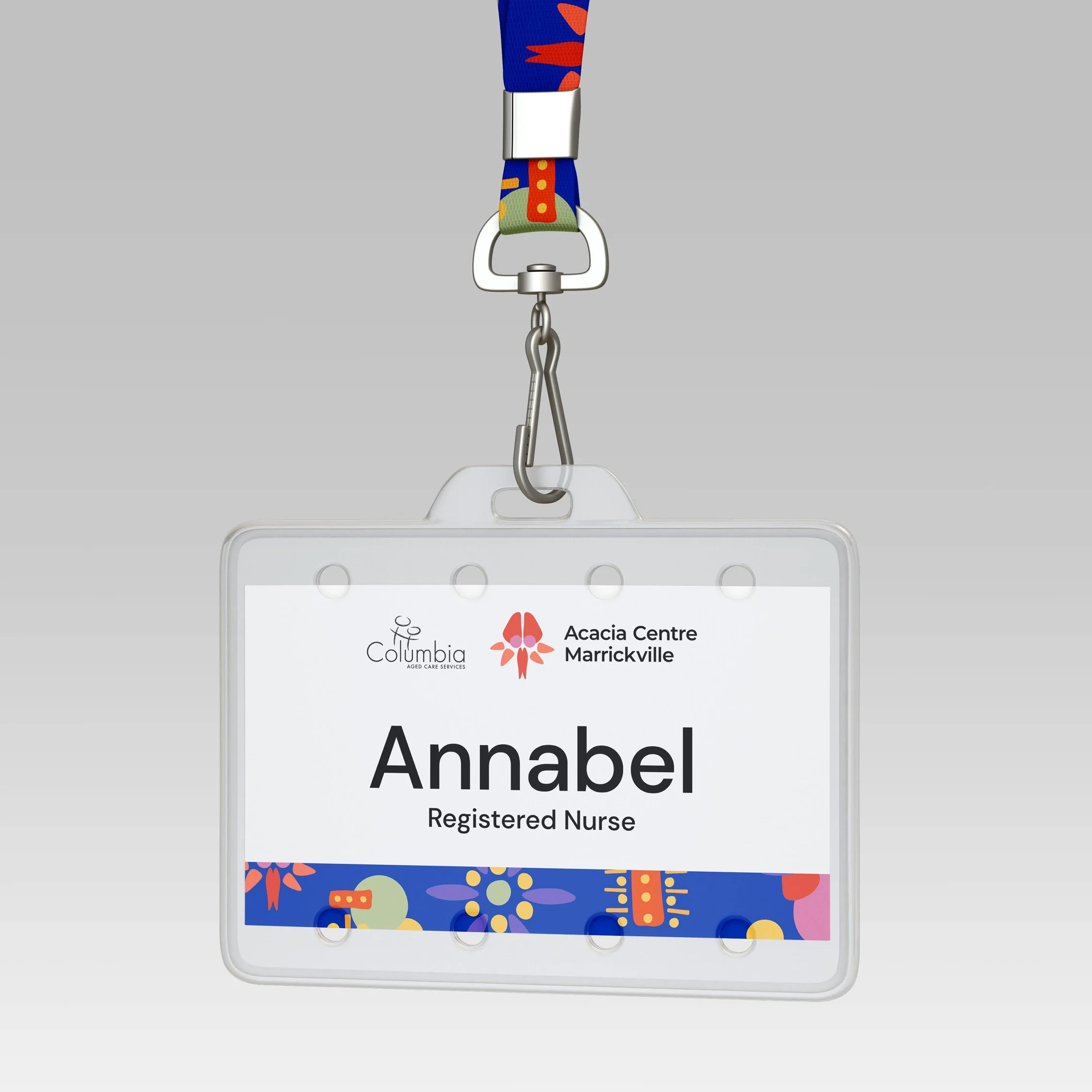
Name tags used large and clear typography for residents to easily identify Columbia carers by name.
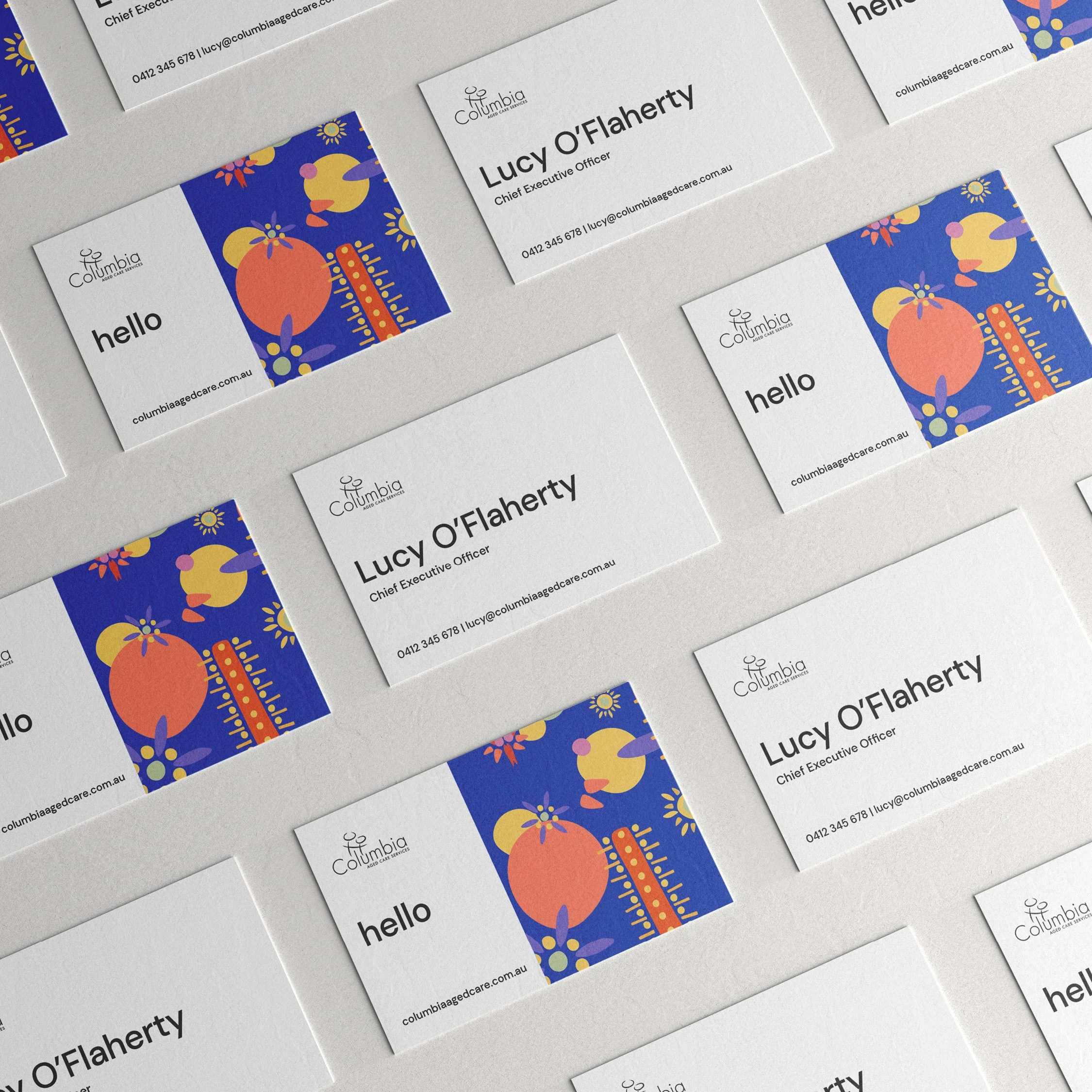
Business cards

Wayfinding
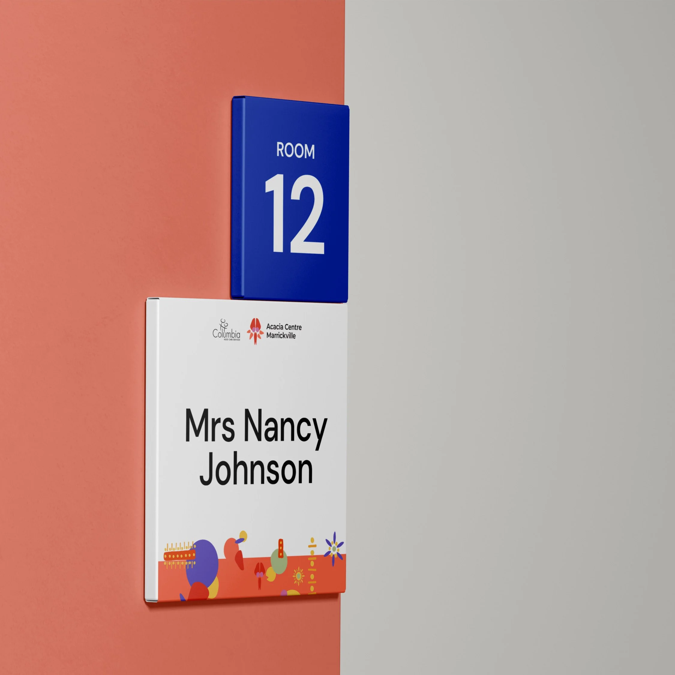
Personalised room signs for residents