Visit Northern Tasmania
Tourism Northern Tasmania undertook a rebrand in 2021, creating a new ‘Visit Northern Tasmania’ identity and communication style to reinvigorate the region as a diverse and exciting tourism region in Tasmania. Launched during times of restricted travel due to COVID-19, the campaign drew southern Tasmanians to the region as well as interstate travellers looking to escape the lockdowns and restrictions in the larger cities.
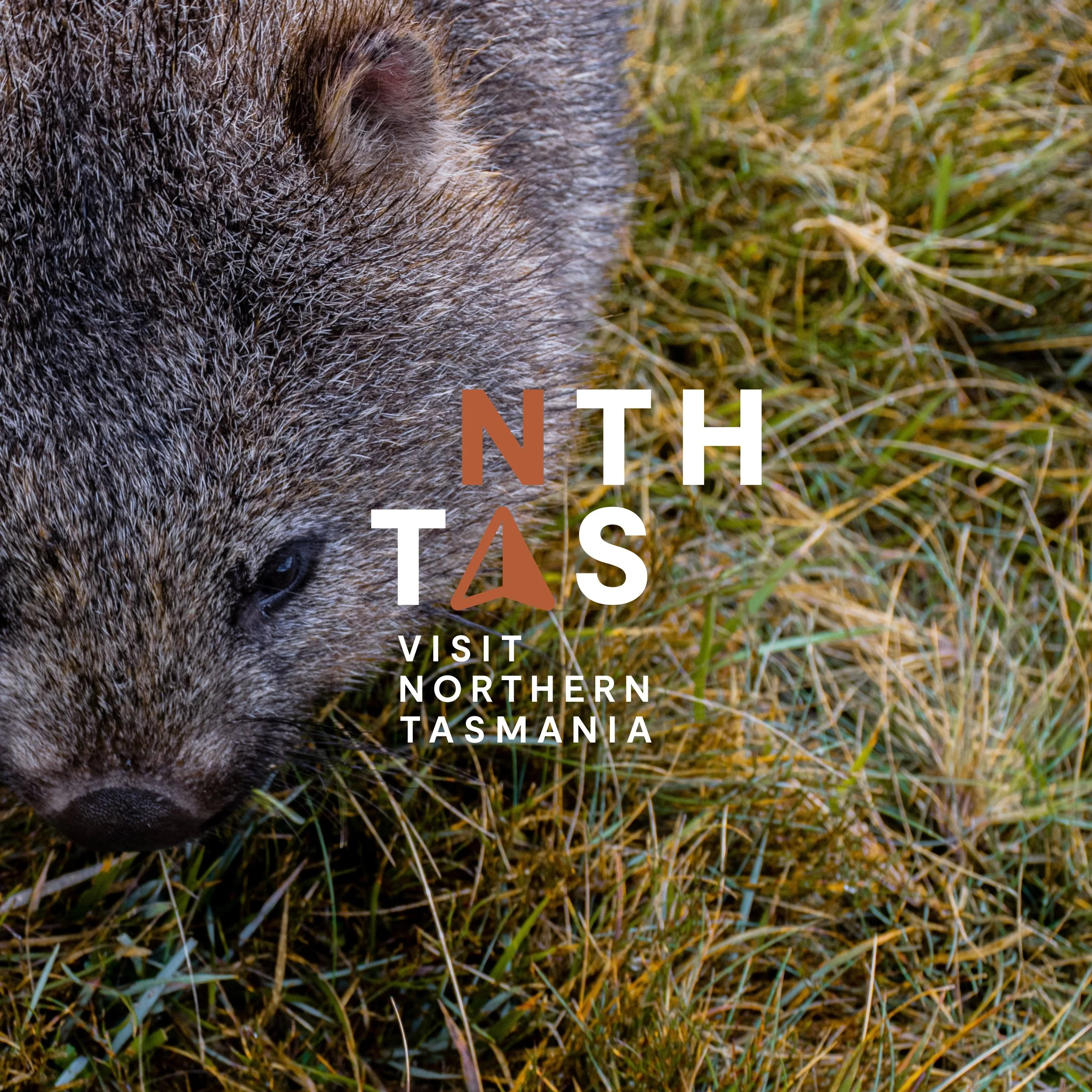
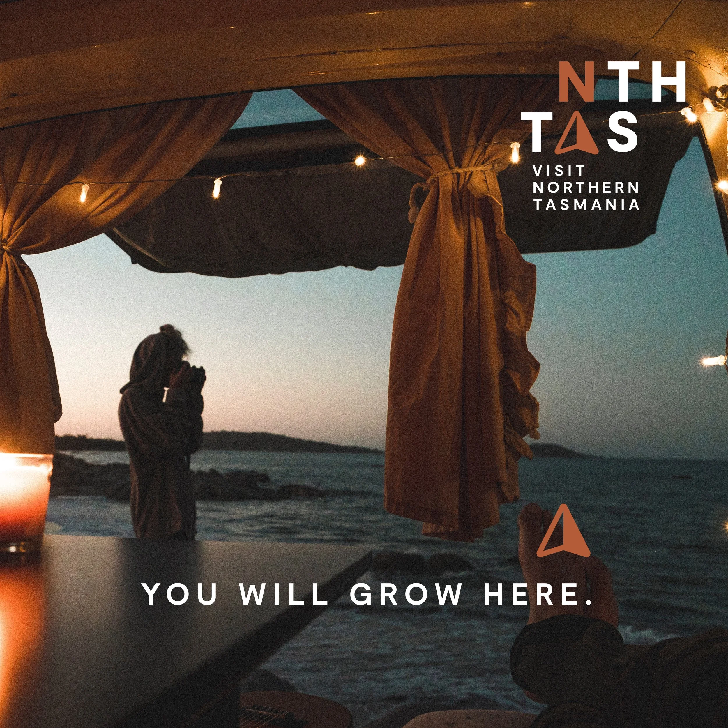
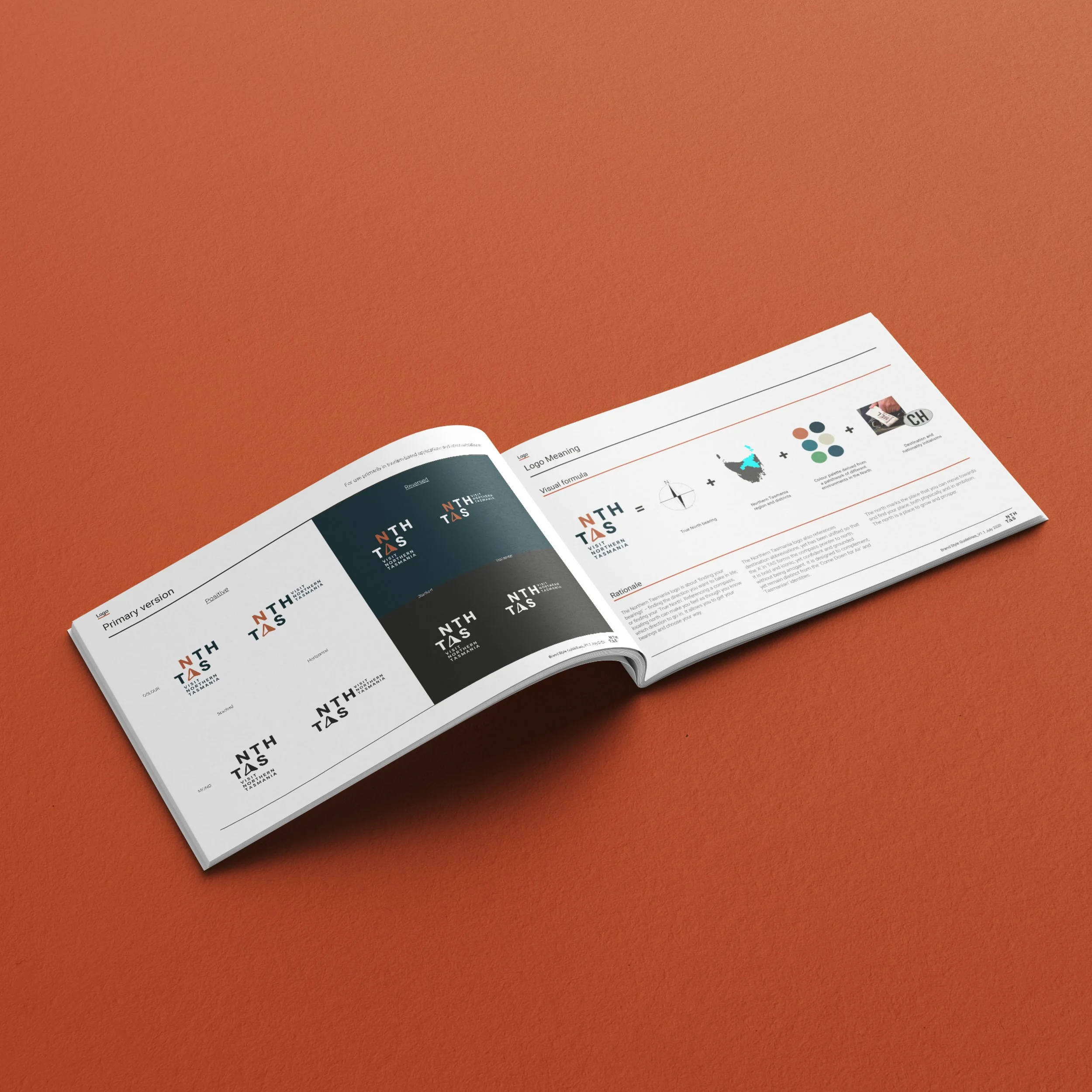
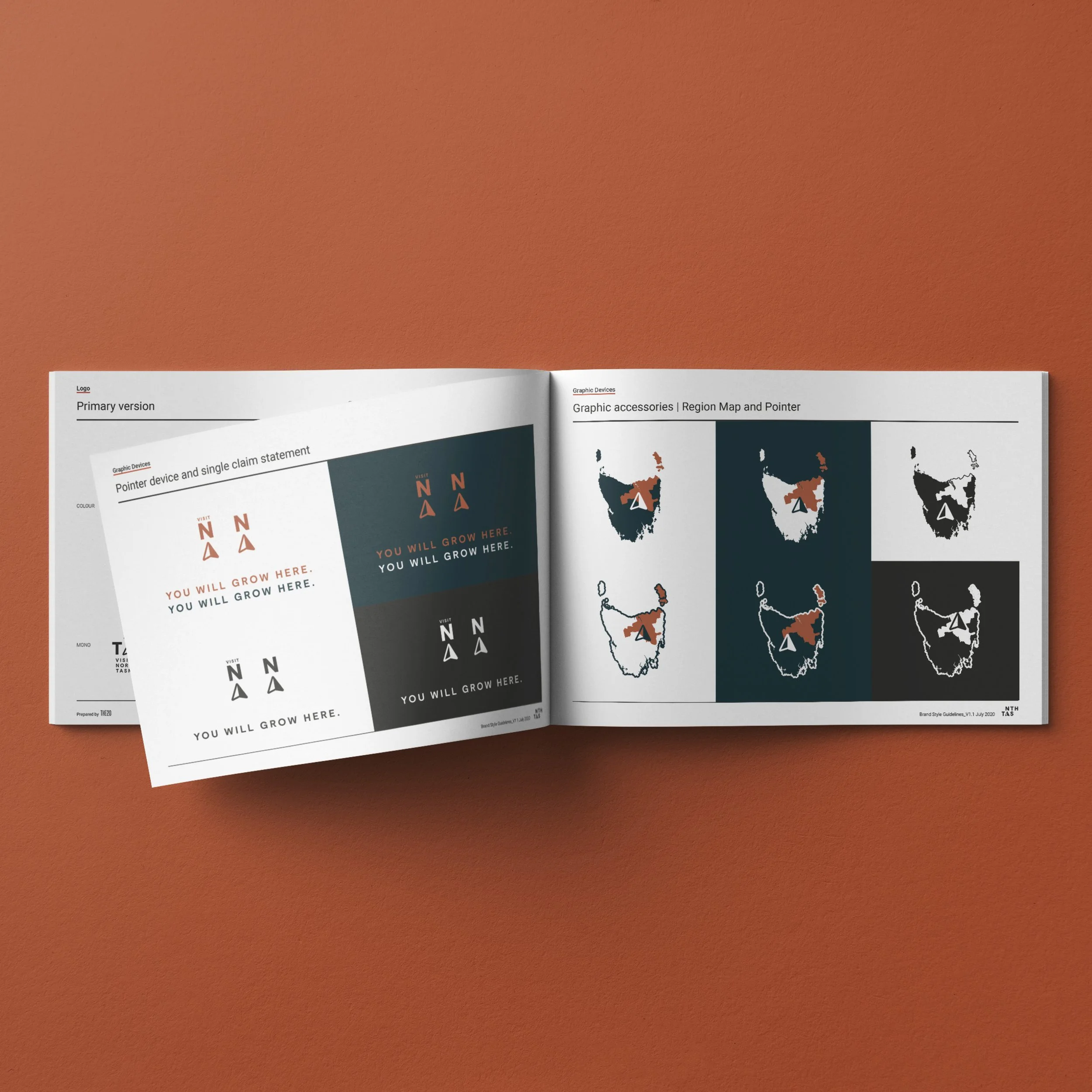
Celebrating connection to place, the Northern Tasmania logo is about ‘finding your bearings’. About finding the direction you want to take in life, or finding your ‘true north – the north is a place to find yourself. The logo also references destination abbreviations, and with a shifted alignment, the ‘A’ in TAS forms the compass pointer to north. The compass pointer also became an important campaign visual device, working in conjunction with the ‘See yourself here’ campaign line, allowing people to see themselves immersed in the experiences of Northern Tasmania.Visit Northern Tasmania was also designed to balance complementing, yet remaining distinct from Tourism Tasmania’s ‘Come Down for Air’ and ‘Tasmanian’ identities.
Studio ©2021 The20
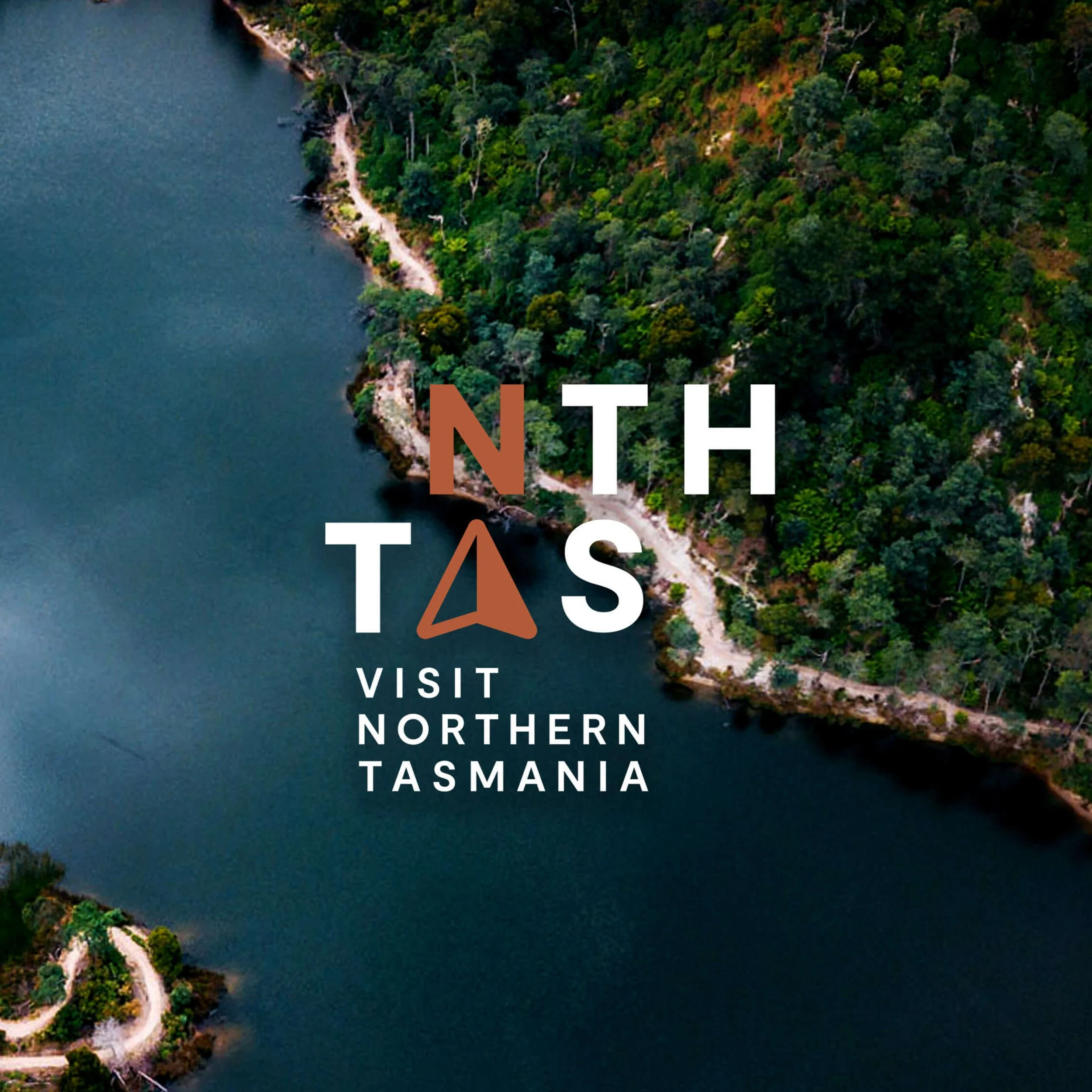
Tourism Northern Tasmania brand identity
Tourism Northern Tasmania brand identity
Tourism Northern Tasmania brand identity
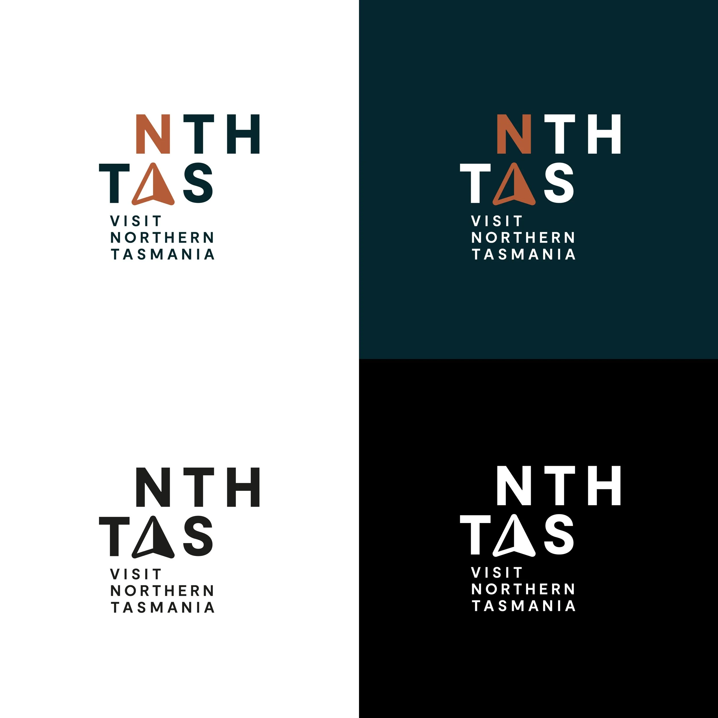
Logo variations
Brand elements
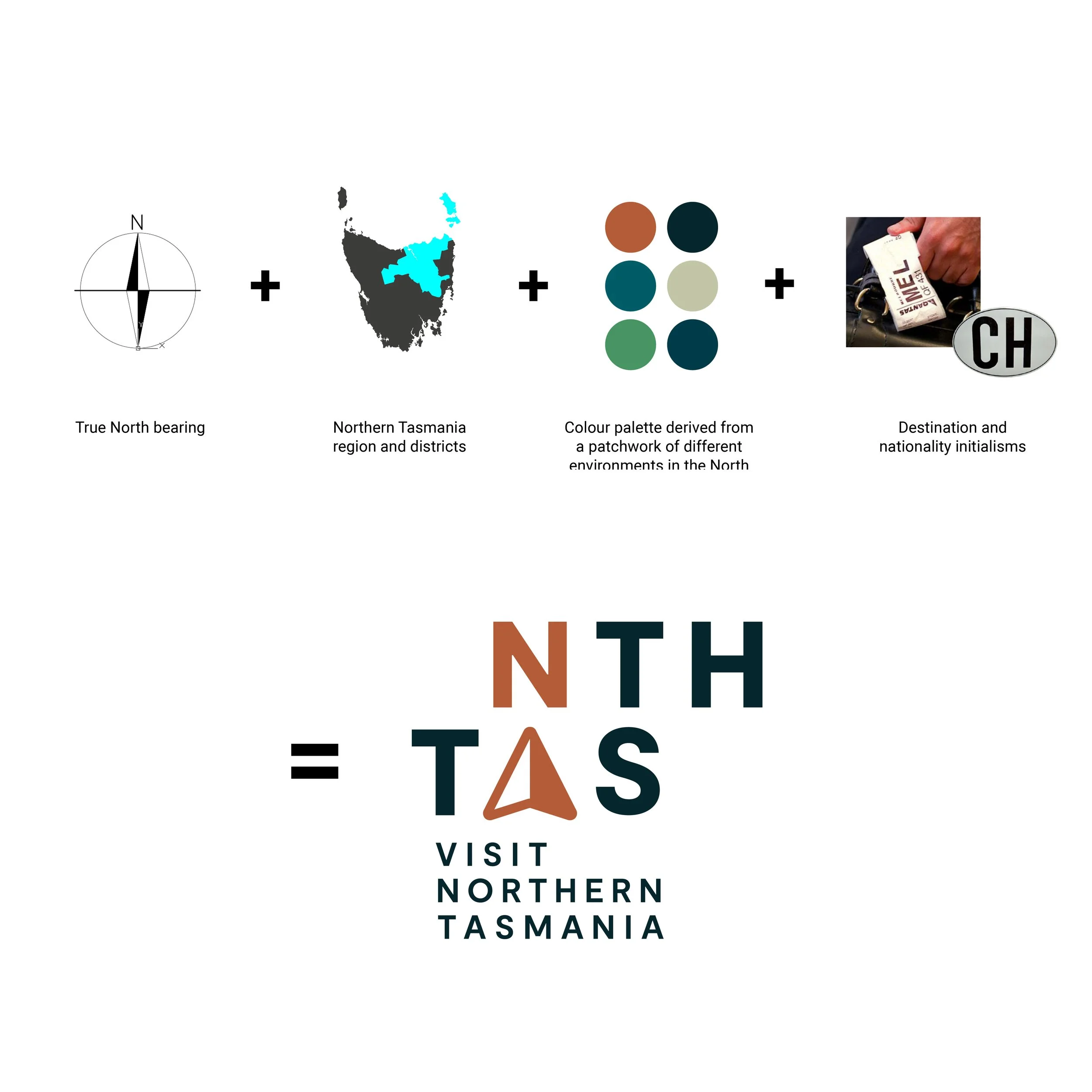
Logo visual rationale
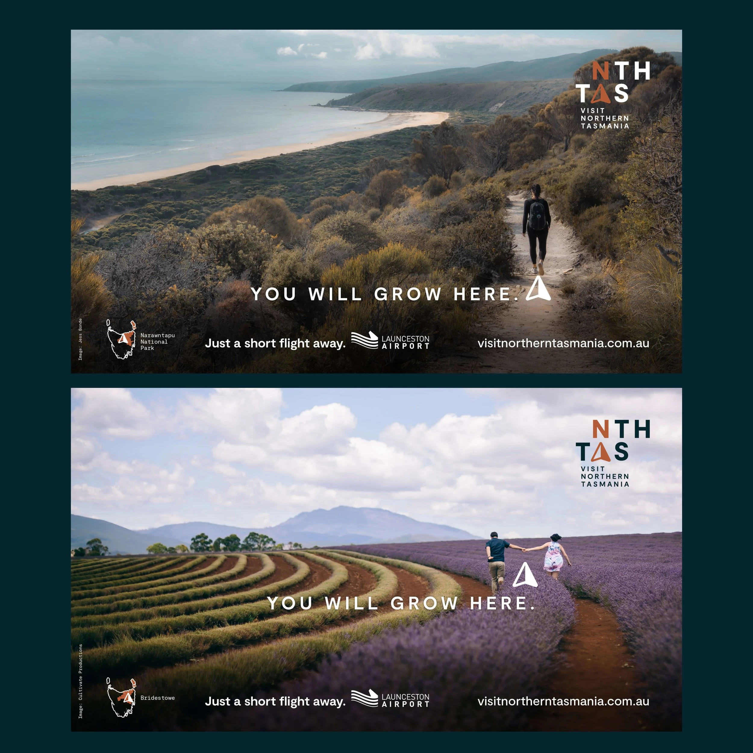
Billboards

Billboard | Narawntapu National Park version
Tourism Northern Tasmania brand identity
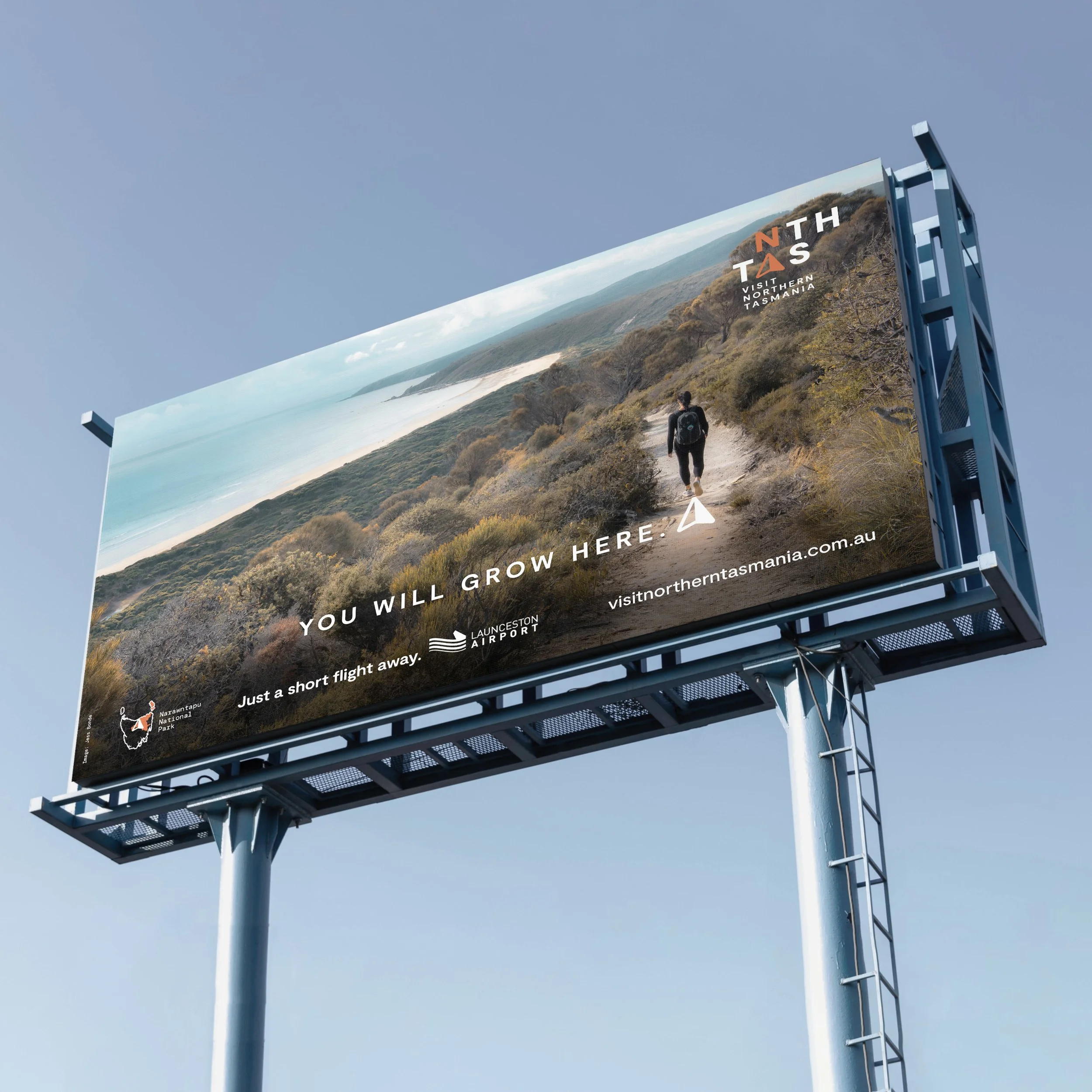
Billboard | Narawntapu National Park version
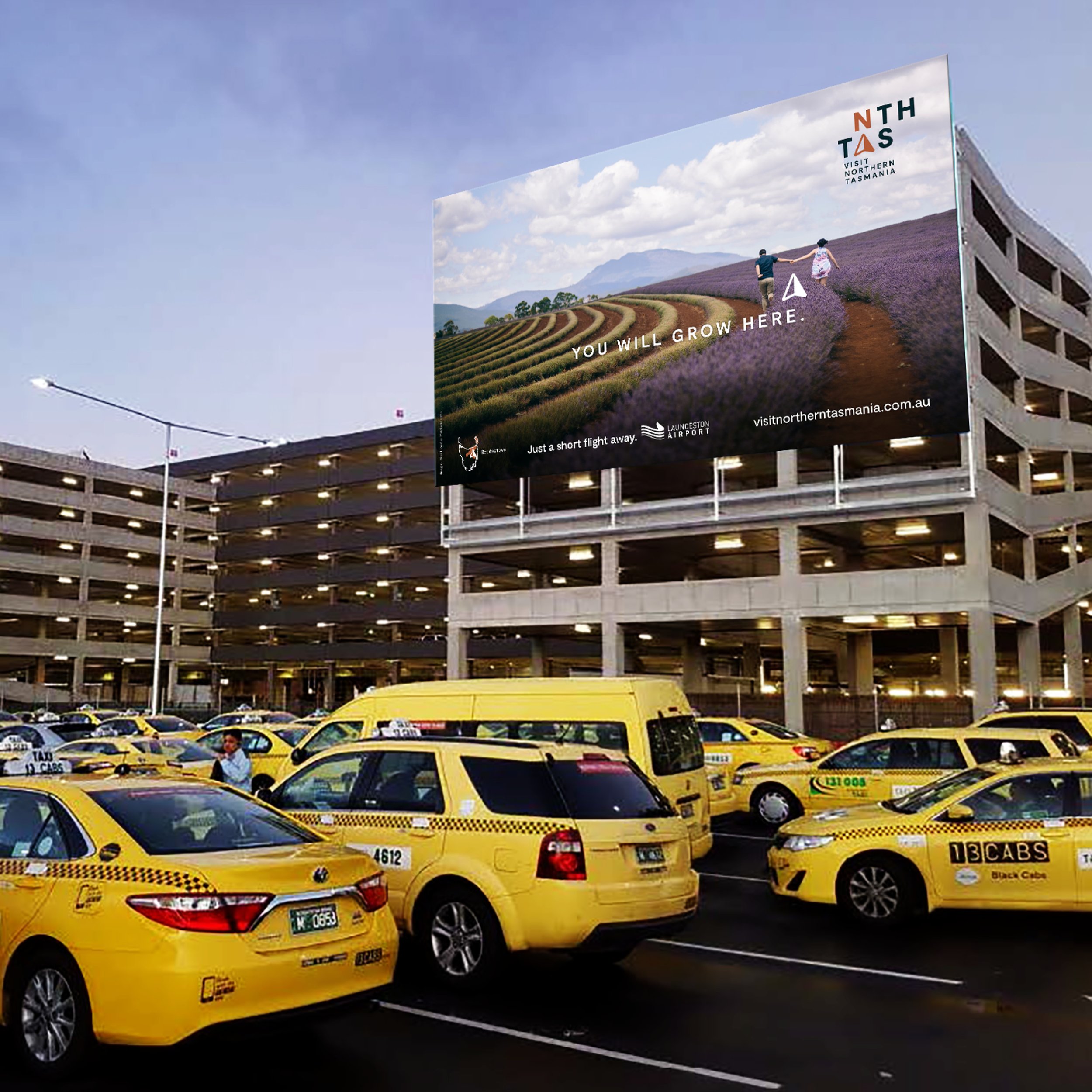
Melbourne Airport Billboard | Bridestowe version
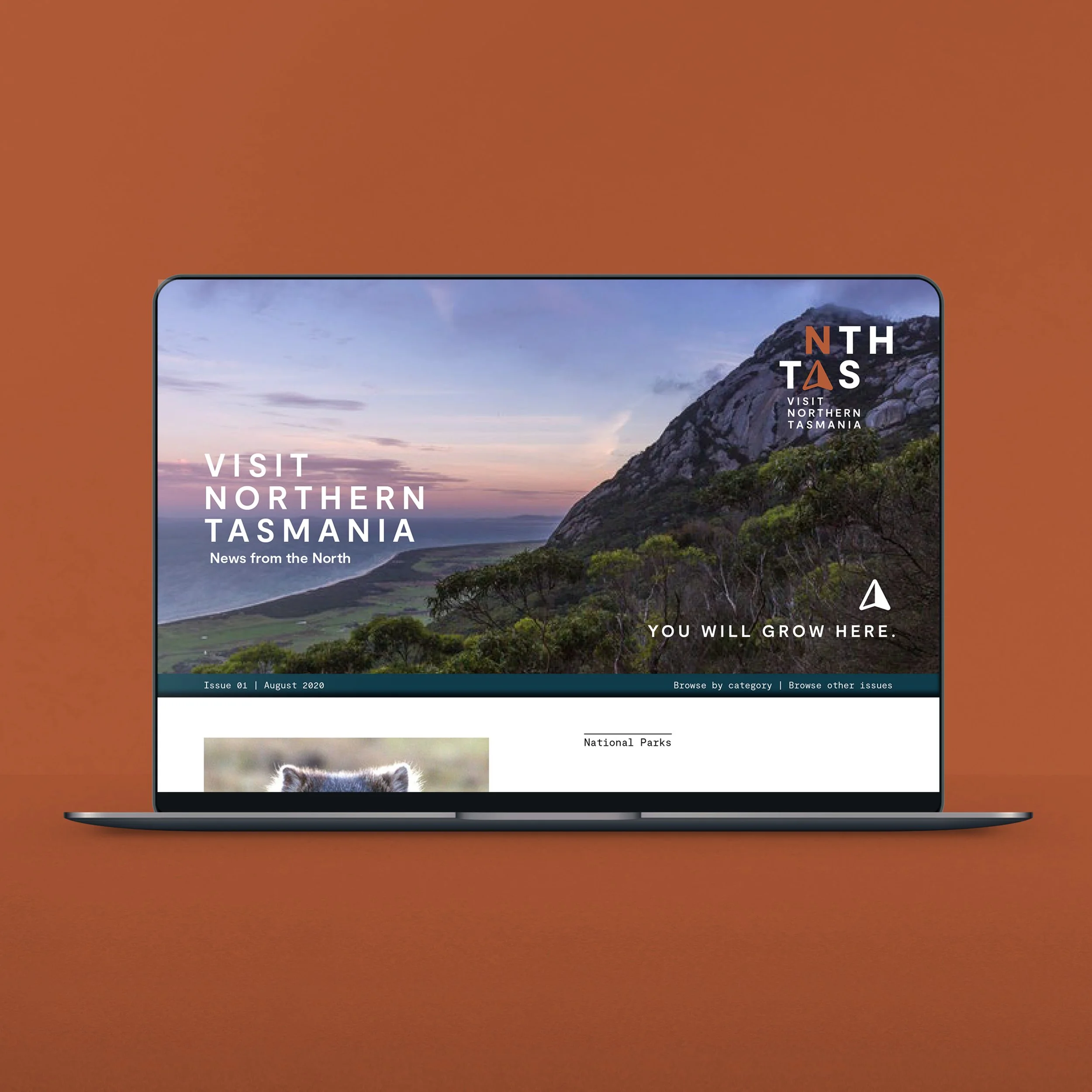
EDM
Brand Style Guidelines
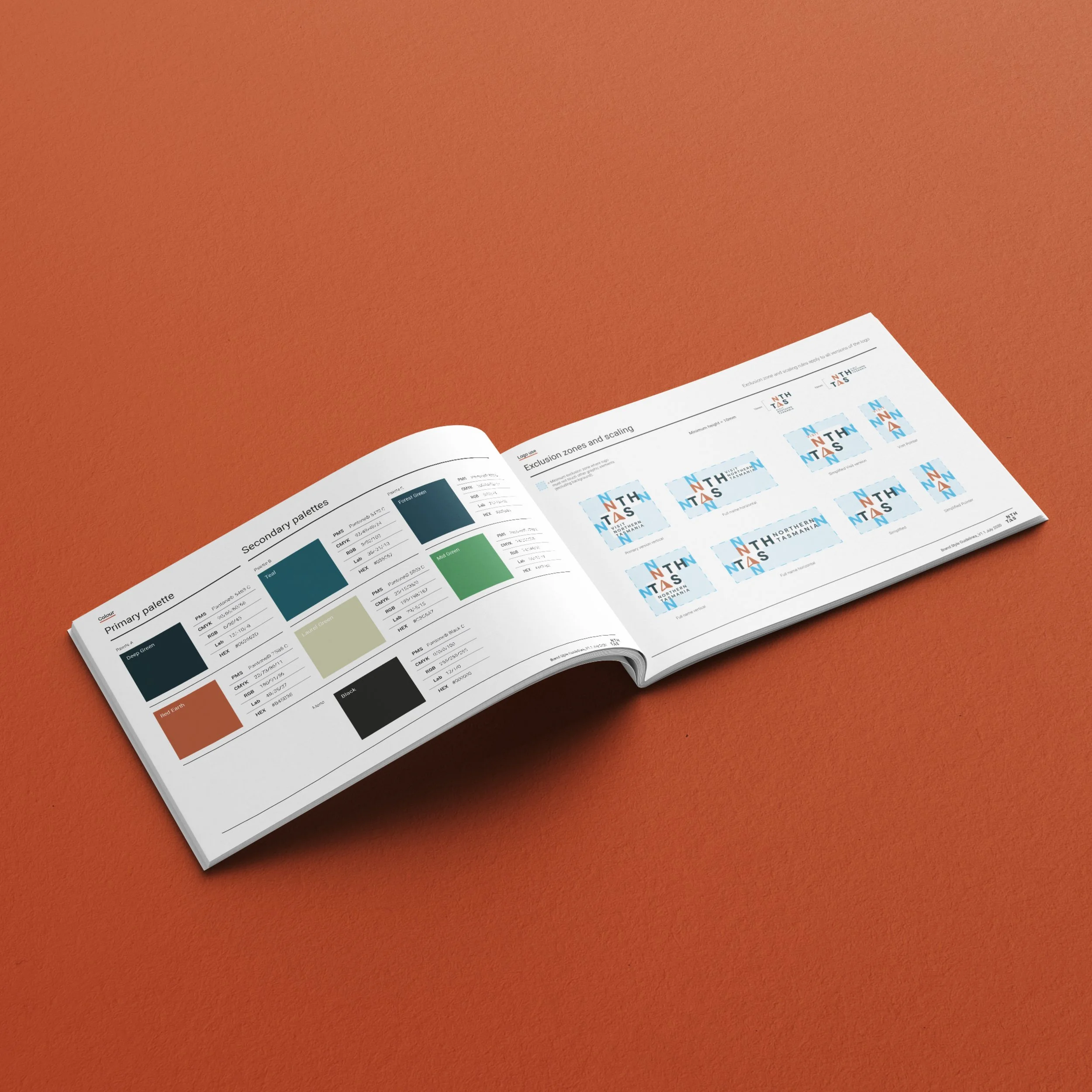
Brand Style Guidelines
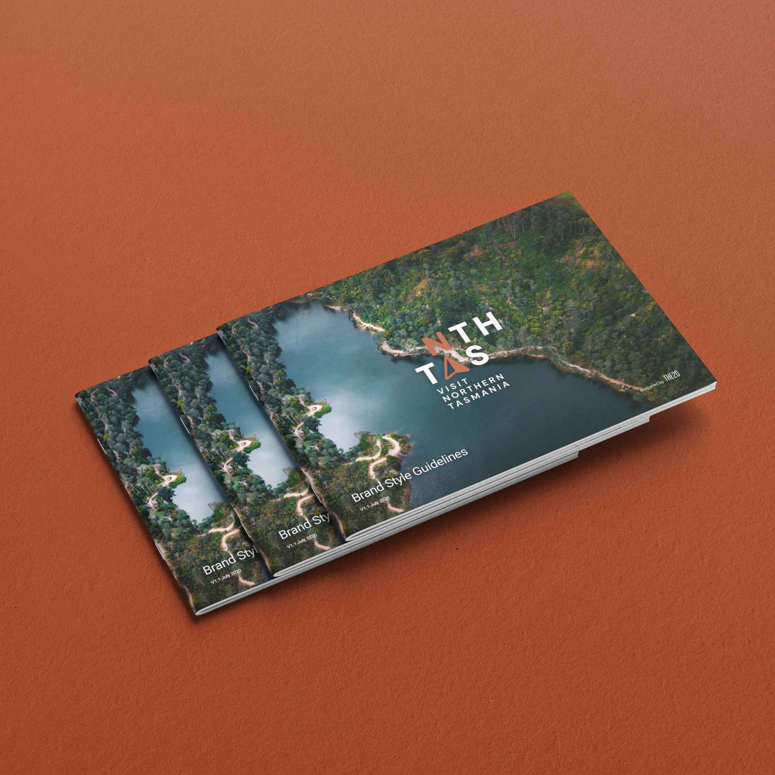
Brand Style Guidelines
Brand Style Guidelines