Metro Ferry Link
Hobart is a geographically difficult city to service with public transport – long and narrow it perched along hillsides along the River Derwent. For many years, the possibility of expanding Hobart’s public system to include ferries has been in discussion. In 2020, Metro Tasmania wanted to explore naming and branding options for a public transport system integrating buses and ferries in the same network.
I started with the naming process, where it was narrowed to ‘Metro Ferry Link’ – where ‘Metro’ is already an established provider, ‘Ferry’ to describe the mode and ‘Link’ to describe the integration between the transport modes and nodes across the city.
From here I started work on the logo where the main symbol is that of an ‘M’ for Metro, the blue and green wavy line for the terrain and river and the dot to represent the transport nodes. I then translated this across a variety of relevant touchpoints, such as ferry livery, ferry node/stop signage and ticketing to demonstrate how the identity might perform in working environments.
Like many projects that might be useful, this one unfortunately has been condemned to a filing cabinet. As public transport projects in Tasmania resume momentum, I hope this project may see the light of day again and become a familiar sight for my fellow commuters yearning for a better network.
Studio ©2019 The20

Metro Ferry Link logo

Metro Ferry Link logo variations and visual rationale

Logo concept sketches
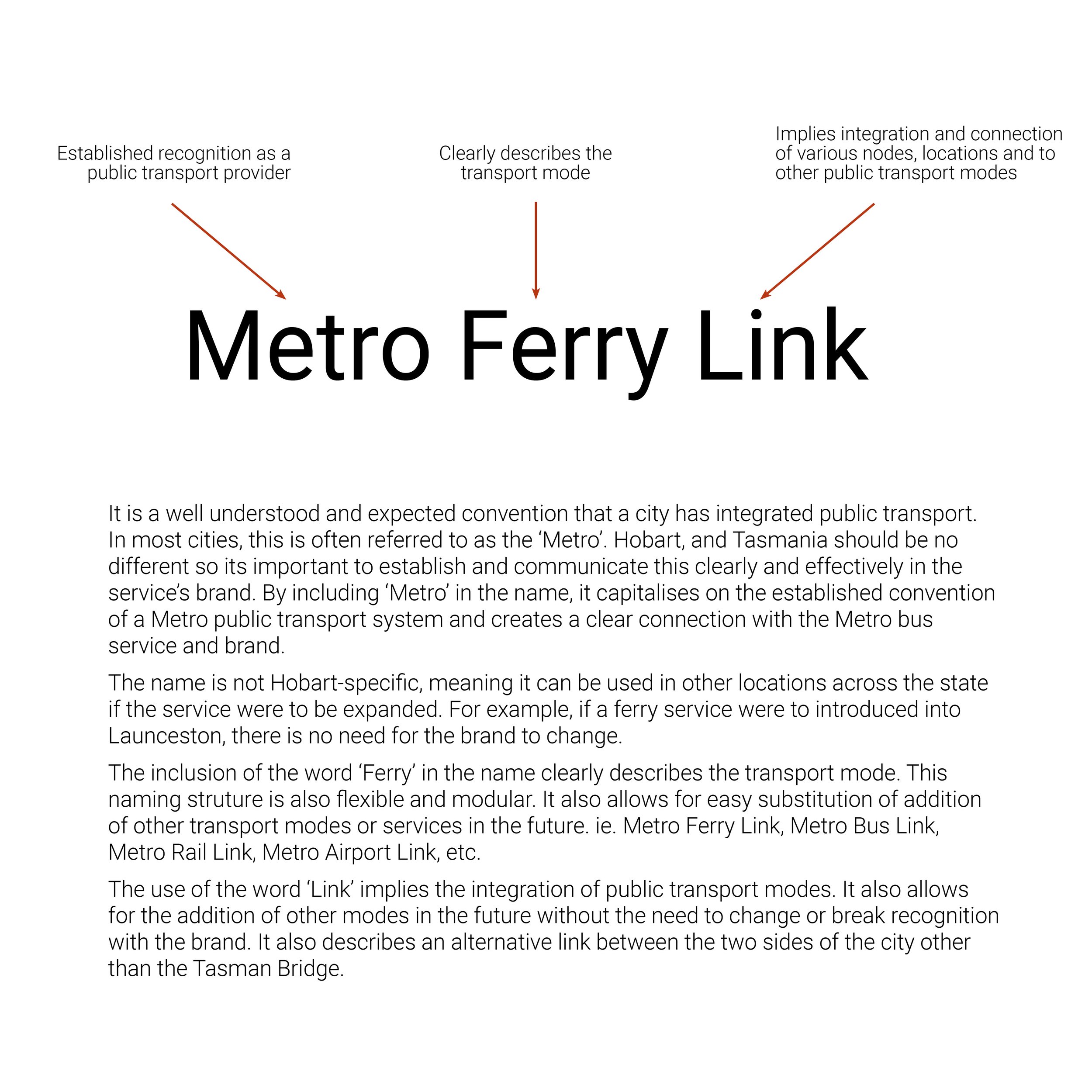
Metro Ferry Link naming rationale
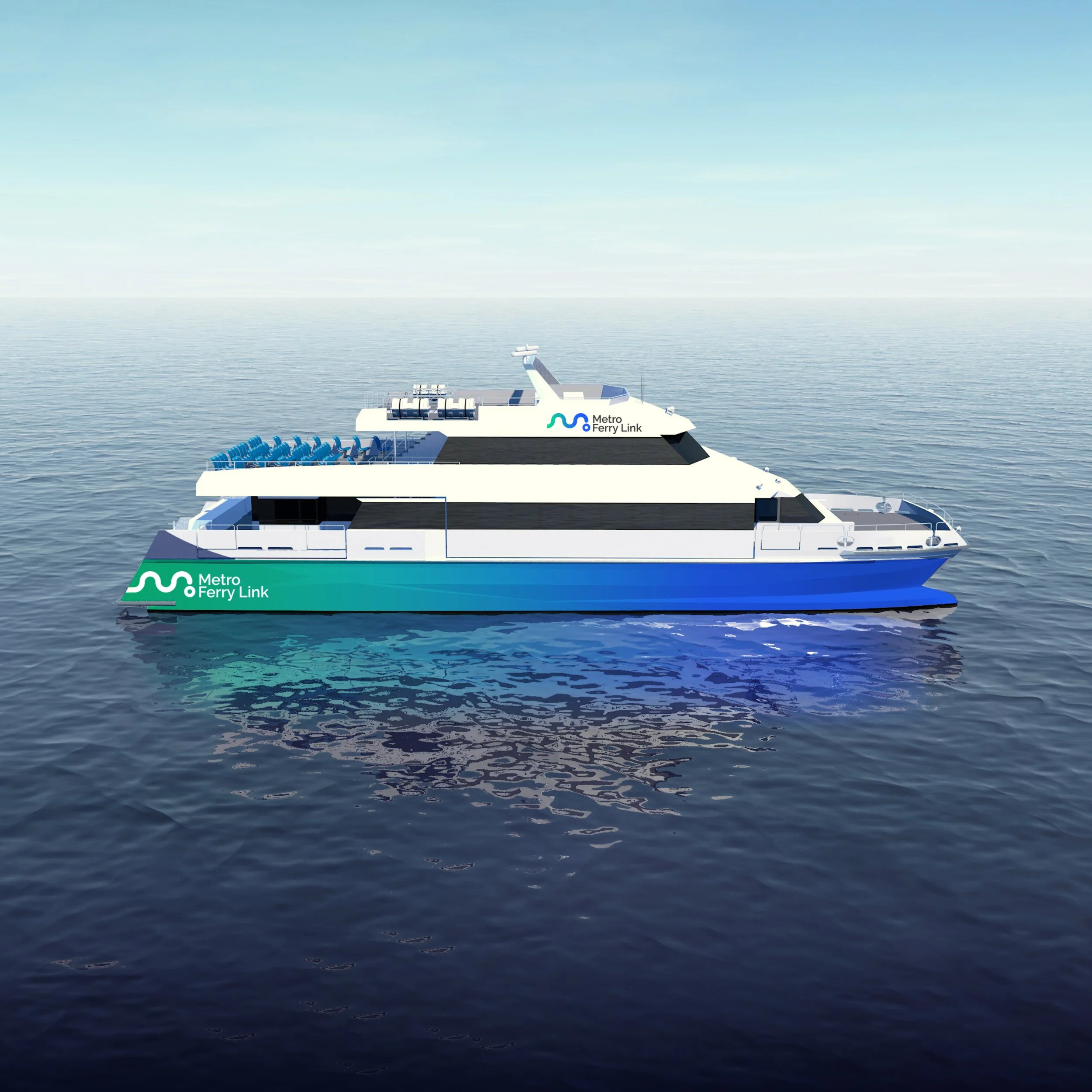
Ferry livery concept
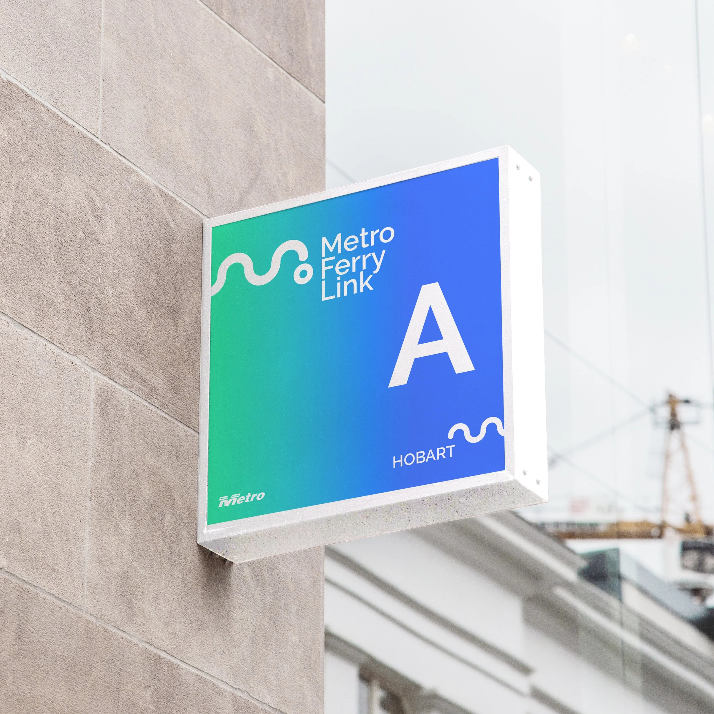
Ferry stop signage

Metro Green Card