The People Project
The People Project believes that everyone deserves to lead meaningful and dignified lives. That’s why they help people move forward in new and positive ways by assisting Tasmanian’s in accessing disability services, navigating aged care, and helping health professionals find fulfilling roles. Previously, The People Project was known as HR+ before approaching Redjelly to develop a new name and visual identity that would better reflect their role as advocates and collaborators.
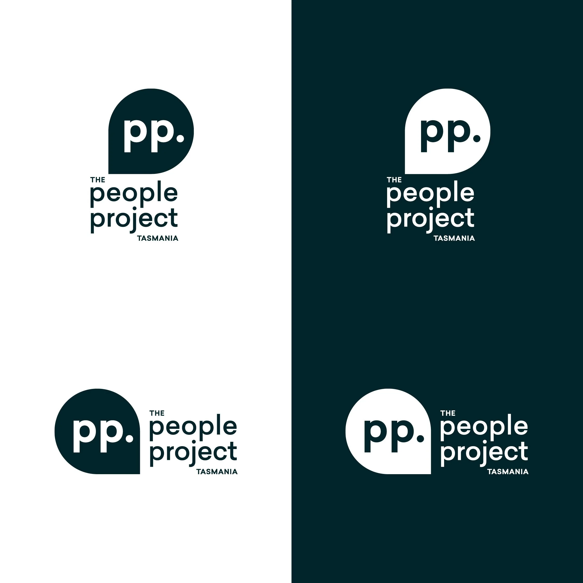
A flexible, adaptable identity was created to reveal the organisations’ many skills and services. The speech bubble device signals the welcoming of open dialogue. Soft, round edges and lower-case typography signal approachability and warmth, while the chosen colours bring energy and optimism.
A simple yet engaging language device was also developed. Using the initialism ‘PP’ and the full stop from the organisation’s name and logo, we built strong associations with positive attributes of the brand. This language device can be adapted for different messaging or expanded to incorporate other attributes for each of the sub-brands. It can also be used on a longer-term basis when applied to merchandise items, banners and signage.
Studio ©2024 Redjelly
The People Project animated logo
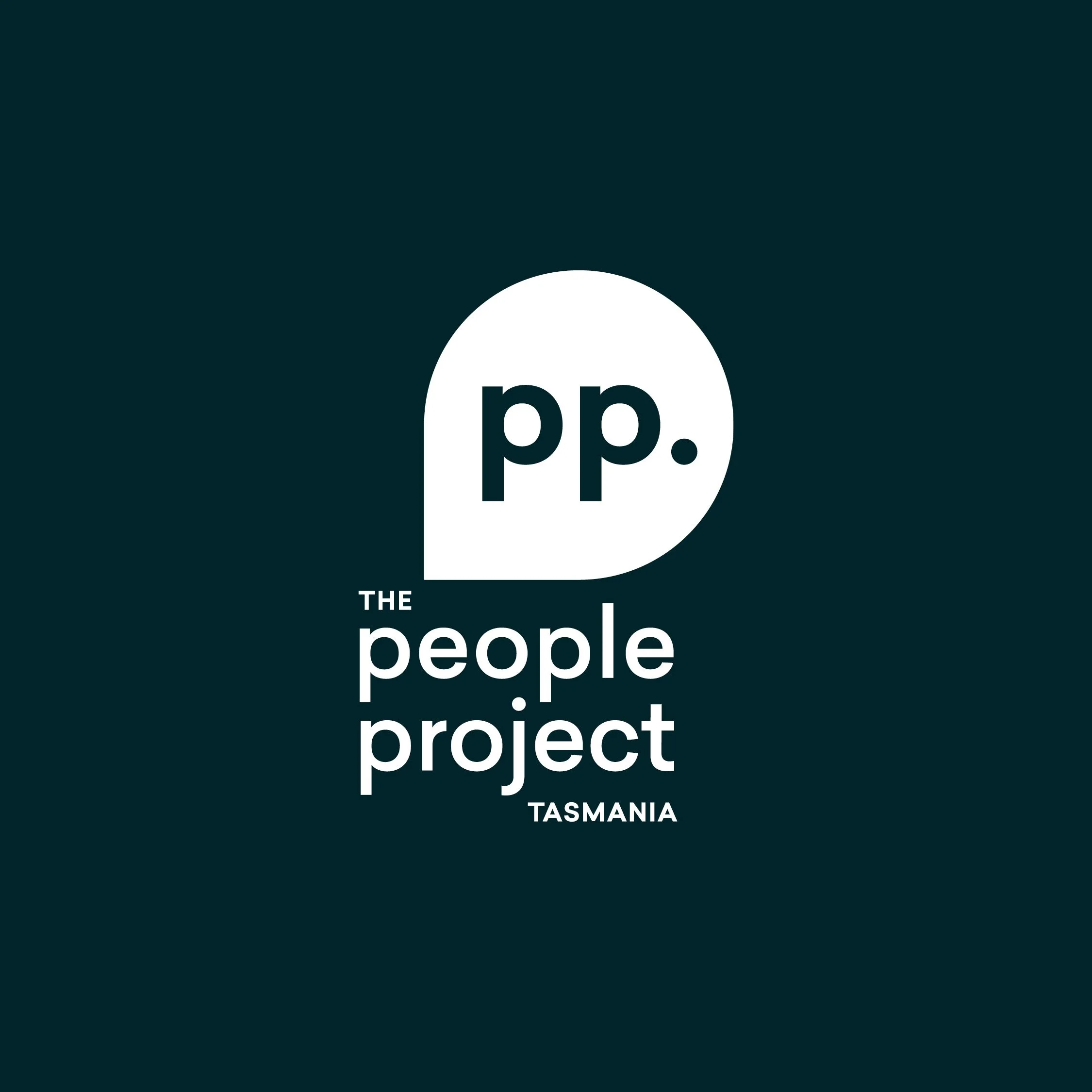
The People Project logo
The People Project logo variations
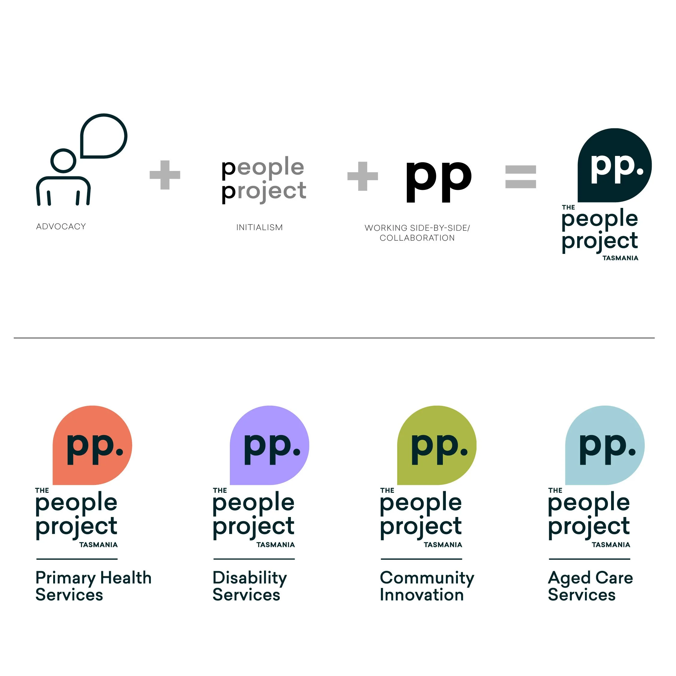
Logo rationale and sub-brands
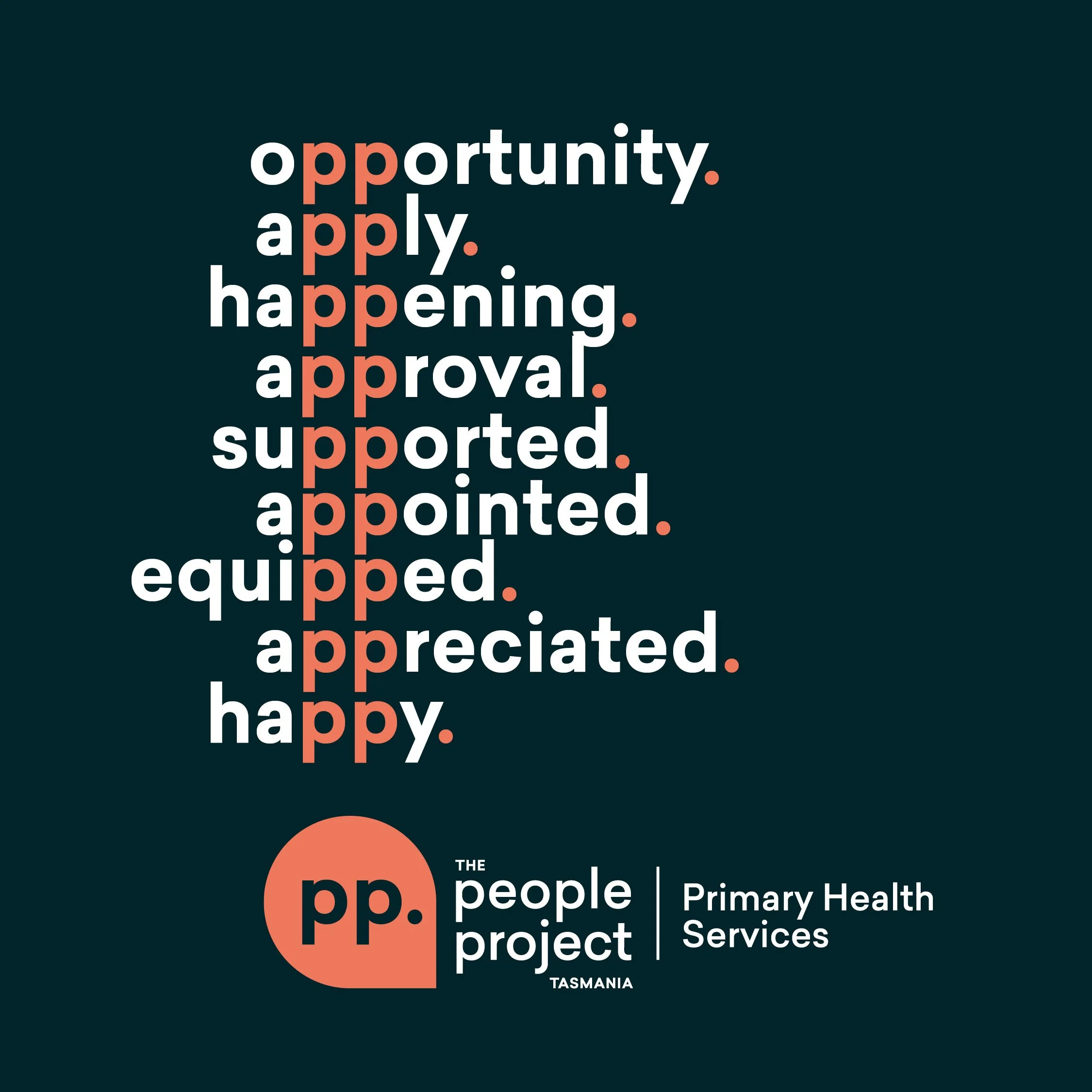
Language device

Primary and secondary colour palette with accessibility considerations
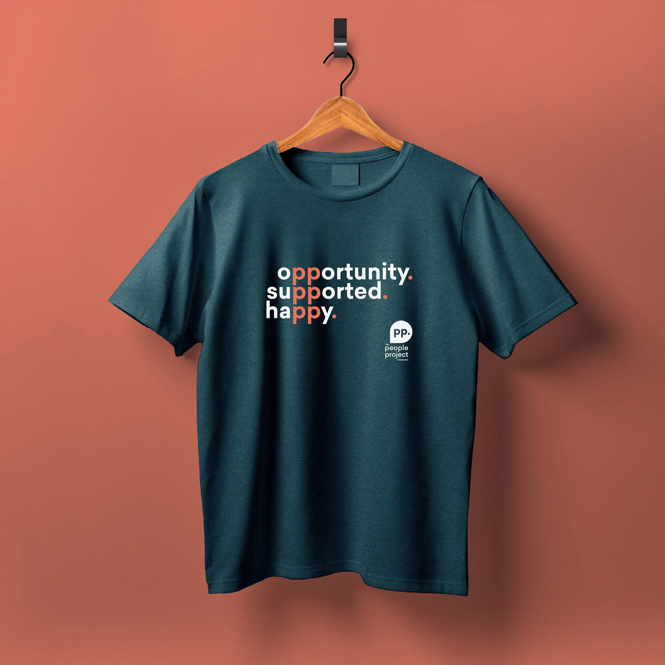
T-shirt using the language device
Brand Book
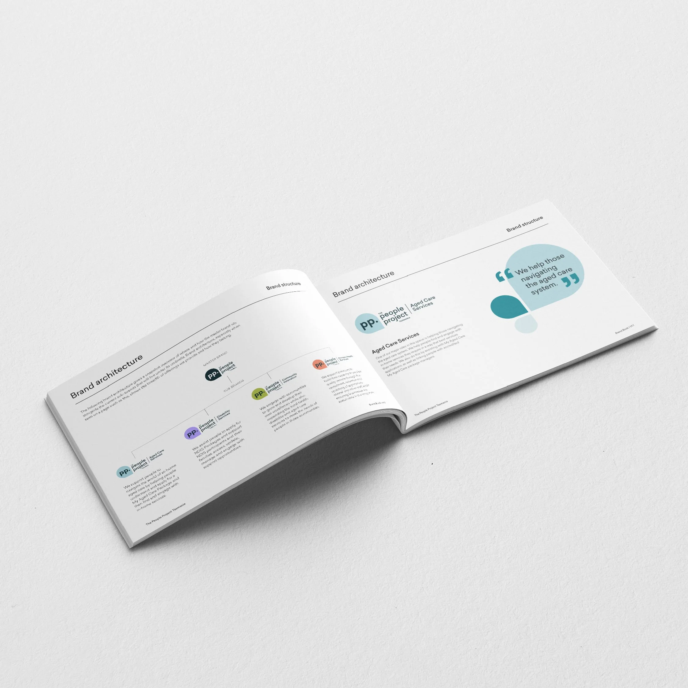
Brand Book
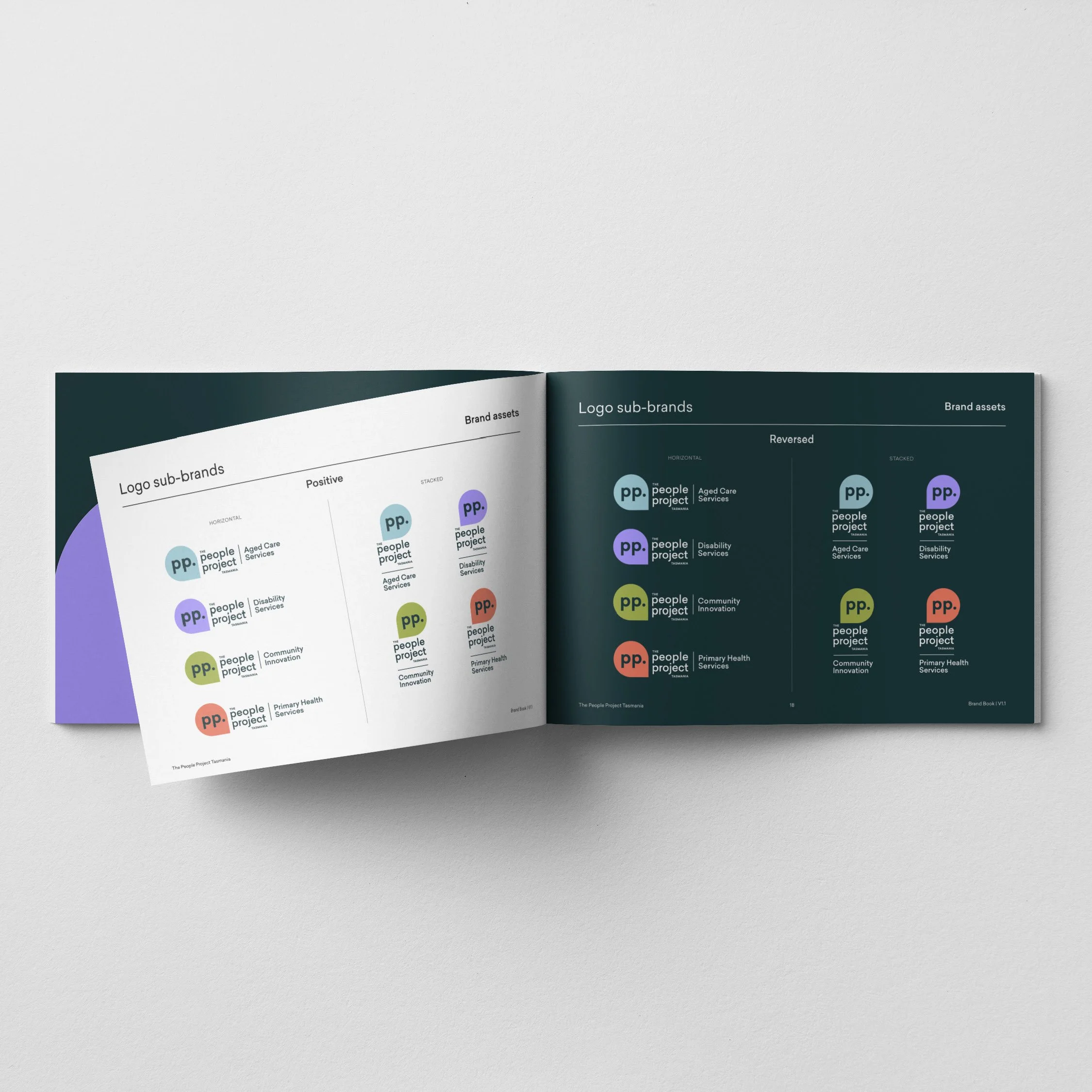
Brand Book
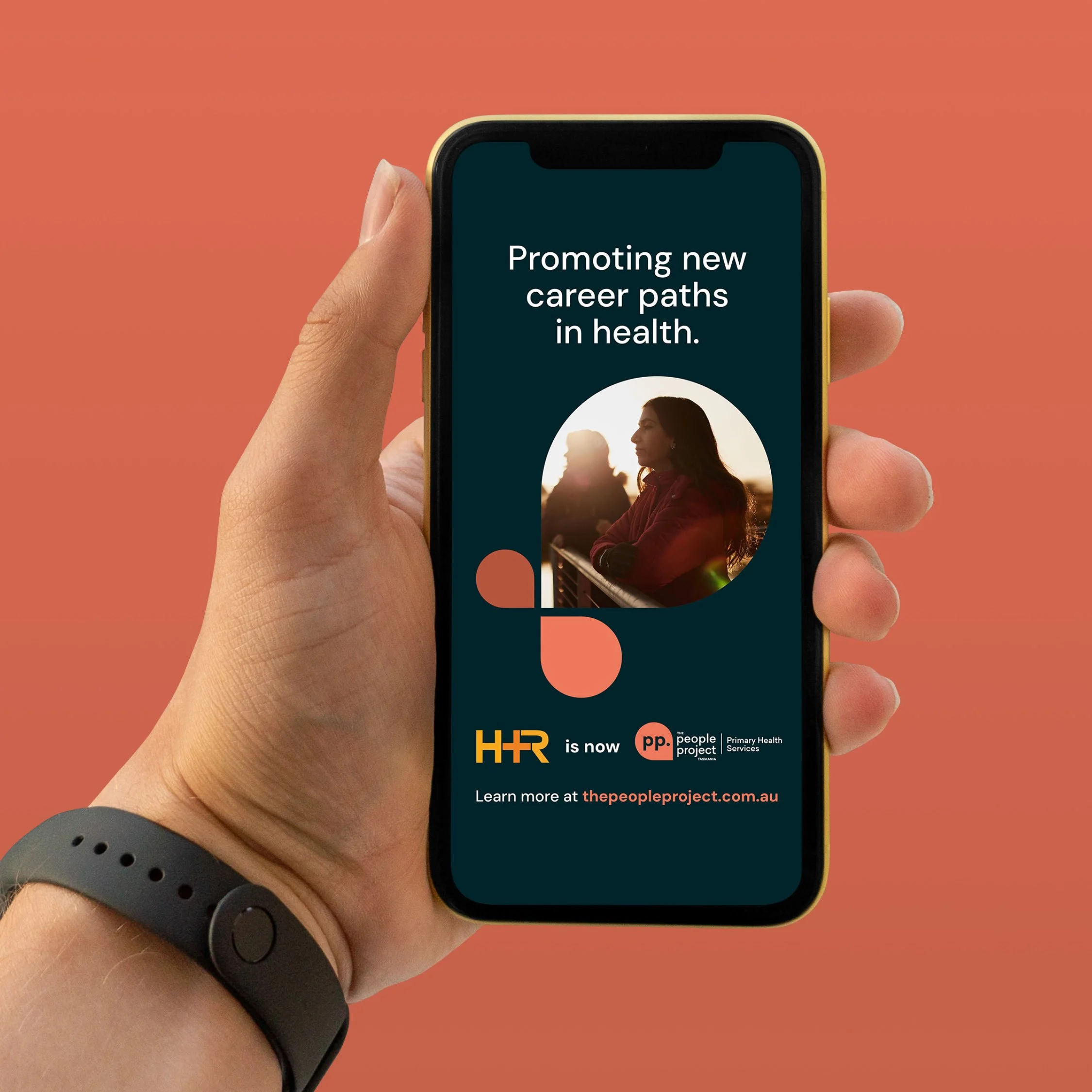
Instagram story
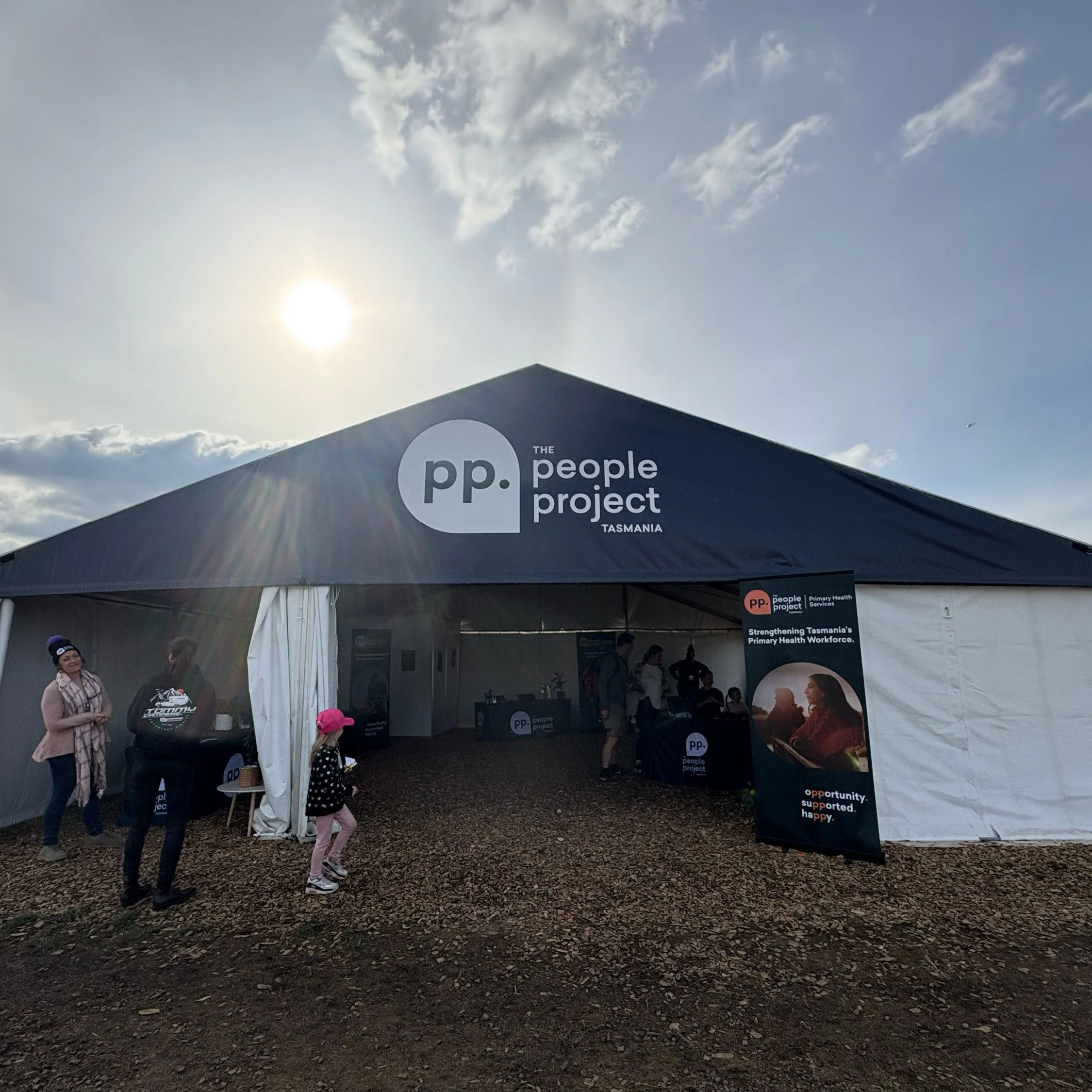
Agfest 2025 tent
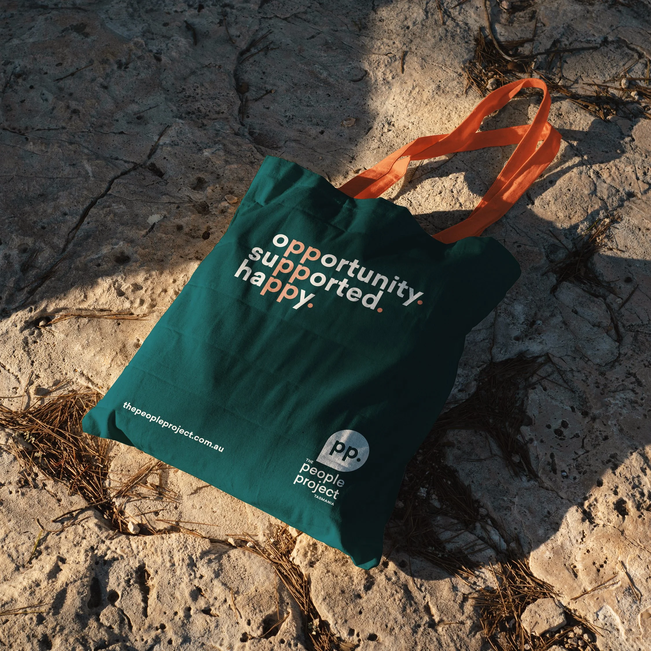
Tote bag
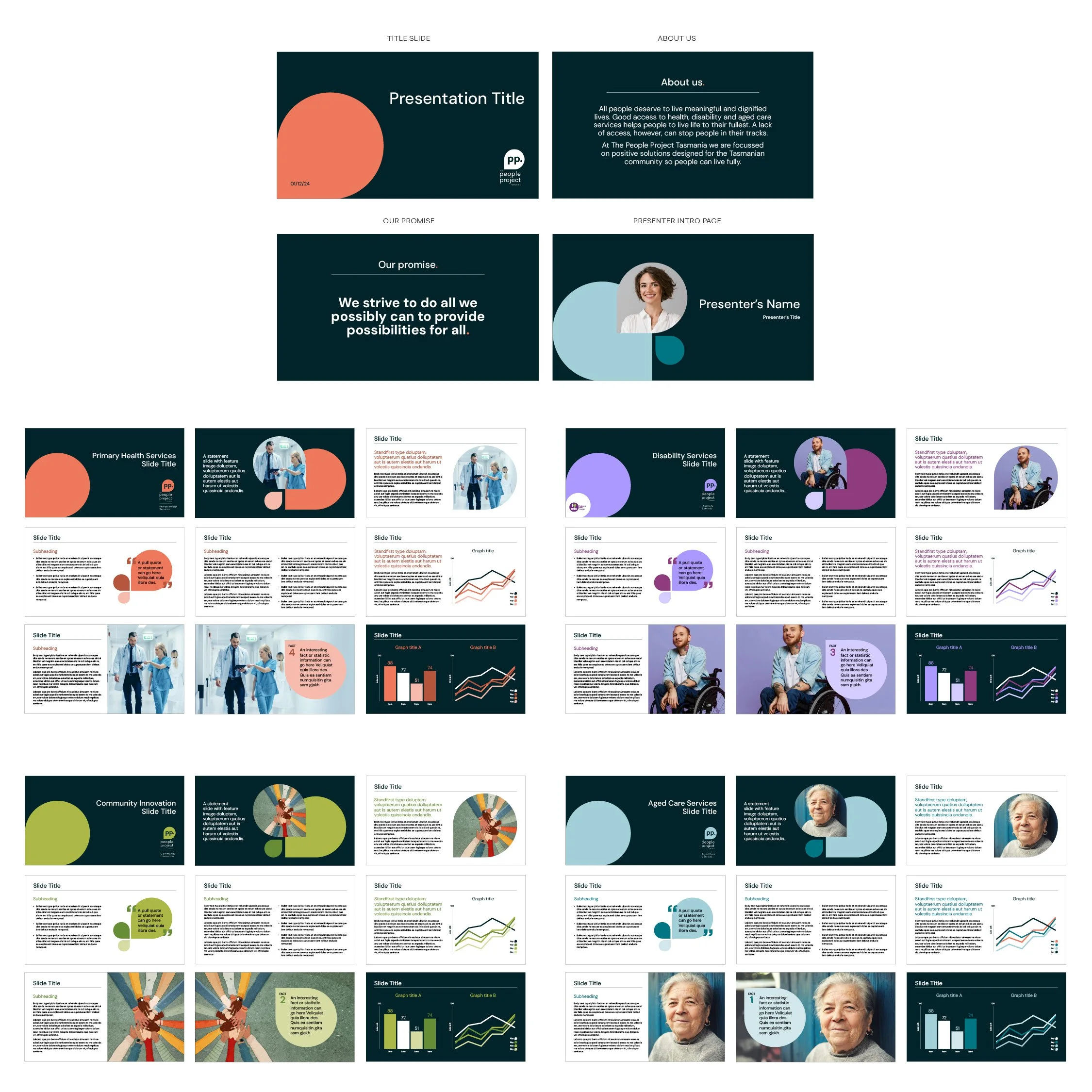
Presentation templates for staff
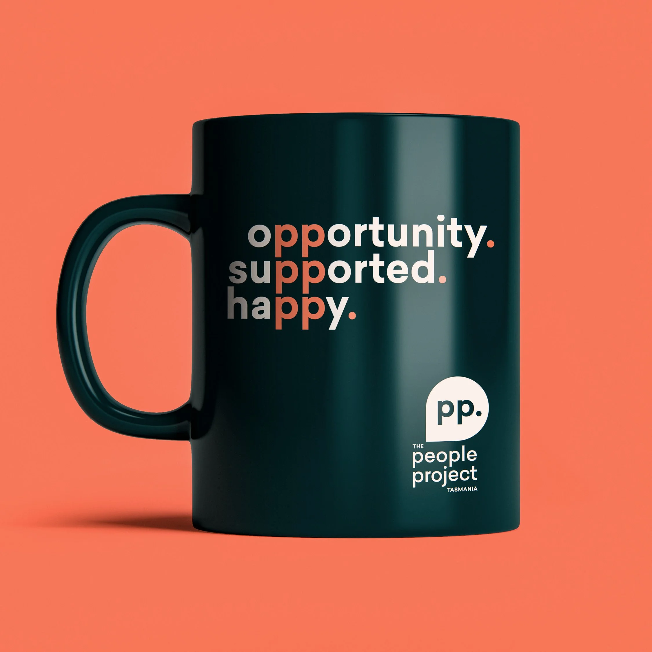
Mug
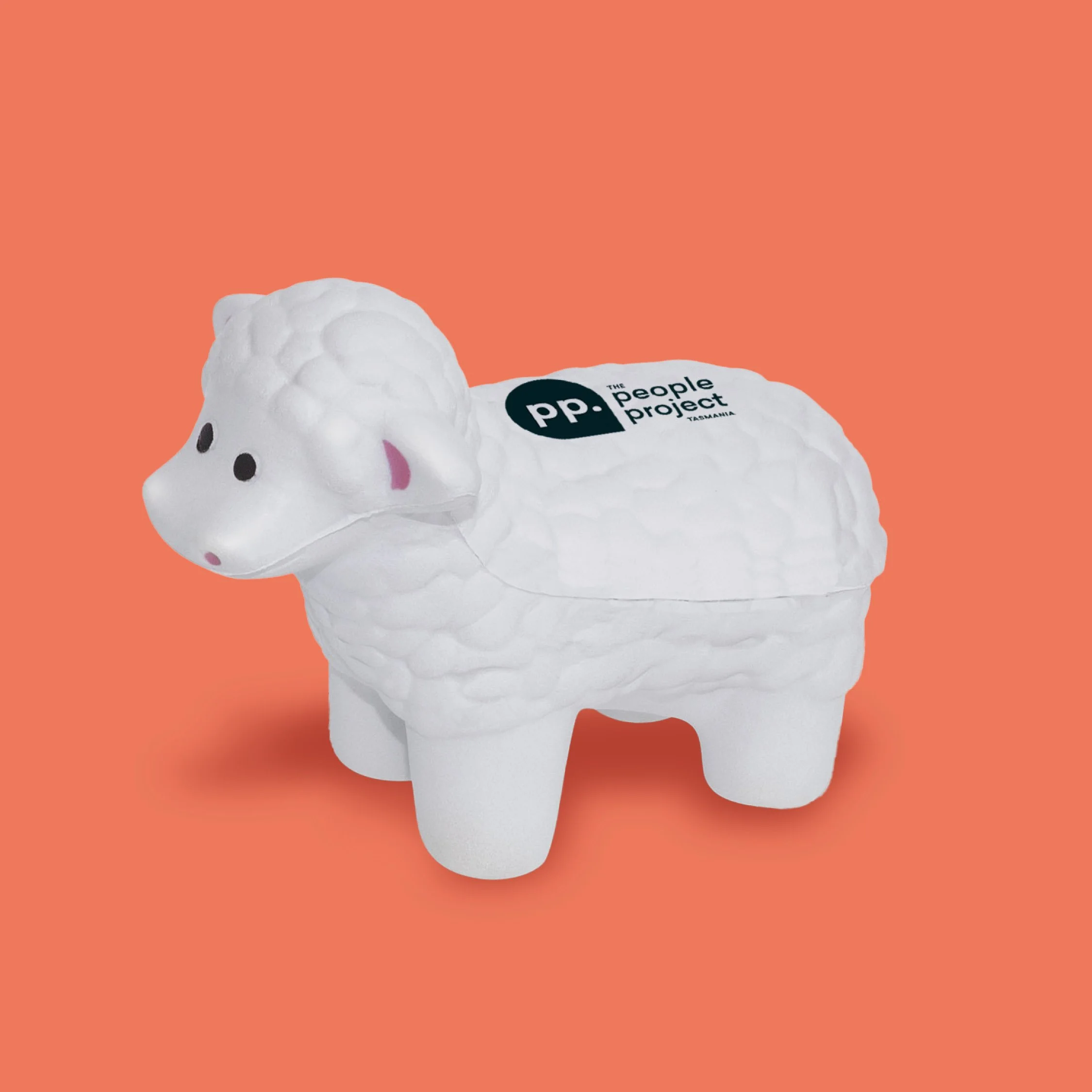
‘Stress sheep’ mascot